- Home
- Best Designs
- Logo
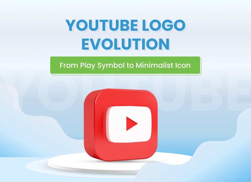
- YouTube Logo Evolution: From Play Symbol to Minimalist Icon
YouTube Logo Evolution: From Play Symbol to Minimalist Icon
-
Last Updated:

20 Aug 2025
-
Read Time:

7 Min Read
-
Written By:
 Harshita Toplani
-
3420
Table of Contents
Explore the evolution of the YouTube logo, from its early red and white roots to today’s minimalist design, highlighting key design trends, color choices, and its rise as a digital-age icon.recognized symbols.
YouTube has been a part of our lives for more than 20 years. Over time, it has completely changed the way people create, share, and watch videos.
One of its most exciting features is that anyone can upload videos easily. From sharing personal memories to creating professional content, YouTube gave people a new way to express themselves and connect with the world.
According to Wikipedia, YouTube is now among the top three most-visited websites in the world. Now with over 23 million channels, five billion videos are watched daily. And has been increasing in popularity.
From humble beginnings to becoming a digital giant, YouTube's journey is nothing short of inspiring.
History of YouTube
 (YouTube Logo PNG)
YouTube was created on February 14, 2005, by three former employees of PayPal – Steve Chen, Chad Hurley, and Jawed Karim. The company is based in San Bruno, California. Each co-founder had a key role in building YouTube.
Hurley designed the logo and layout, Chen worked on video uploads and playback, while Karim focused on coding and site structure. They had a simple yet powerful idea was to build a place where videos could be shared freely and instantly.
YouTube was just a scrappy startup in 2005. Other video-sharing sites, such as Vimeo, existed then, but YouTube was the standout. The platform’s slogan “Broadcast Yourself” was, in this sense, spot-on.. It encouraged users to think of their profiles as personal channels, much like their own mini TV stations.
This idea of user-powered broadcasting, combined with video-on-demand, set the foundation for YouTube’s explosive growth and unique place in the digital world. Later on, seeing this growth, Google acquired YouTube in October 2006.
As of now, More and more people have started using it, not just to upload fun clips but also to learn, teach, promote businesses, and entertain.
Evolution of the YouTube Logo
Compared to other social media platforms, the YouTube Symbol hasn’t gone through any big makeover. Most people just remember the black logotype and the red square.
Now, it’s just a white play icon inside a big red rectangle that looks like a TV screen. Only that change is enough to tell us—yes, the old YouTube logo has evolved.
Let’s take a look at the history of YouTube logos to understand the small and big changes over time. And see how it has managed to remain one of the most iconic emblems over the years.
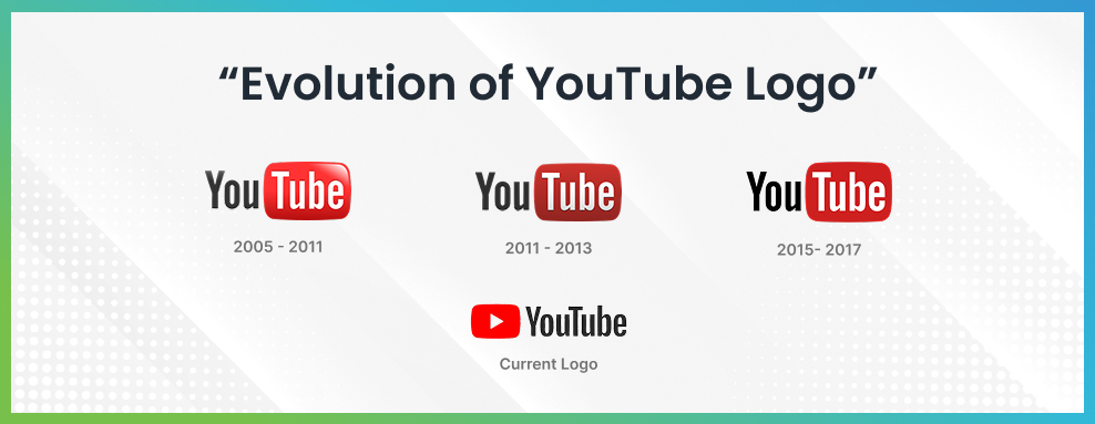
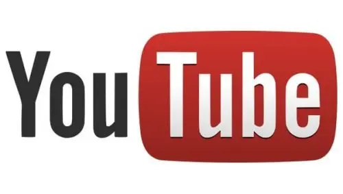
The Original - First YouTube Logo (2005-2011)
When YouTube launched on February 14, 2005, its logo featured “You” in black and “Tube” inside a glossy, rounded, red TV-like box. This YouTube TV Logo has a red box with a gradient, giving it a subtle 3D look, playing on that “tube” (old television) idea.
The Second Serious & Matte YouTube Logo (2011-2013)
In late 2011, YouTube flattened that red box, removing most of the gloss and gradient. It switched to a matte, less dimensional style. The contrast felt more modern and refreshed. A leftover shadow on the text hinted at the older style, which kept the essence of the YouTube old logo.
The Flaten & Simple YouTube Logo (2013-2015)
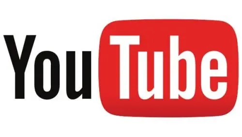
The next tweak came in December 2013: they removed the inner shadow entirely and brightened the red background in the YT logo. It embraced a fully flat look, aligning with the minimalist design trend.
The Trendy Darker YouTube Logo (2015-2017)

Around October 2015, YouTube darkened the red shade and stripped away all gradients. This shift coincided with YouTube logo history & the launch of YouTube Red (Premium), reflecting a more mature, serious branding style.
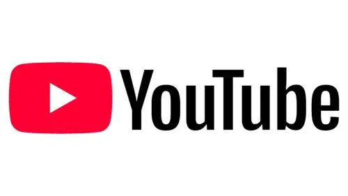
The “Play” button- YouTube Logo (2017-2024)

August 29, 2017, marked the first major overhaul: the iconic red play icon moved to the left of a new, all black “YouTube” wordmark in a custom “YouTube Logo Sans” typeface. This New YouTube Logo icon could now stand alone, making the brand instantly recognizable.
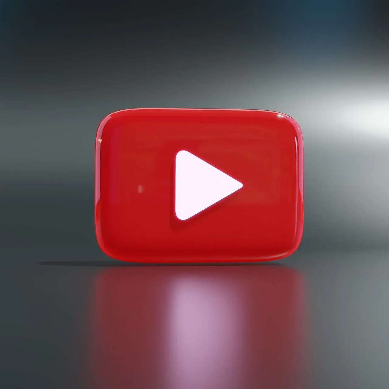
The Resized Second Generation YouTube Logo (2024-Present)
Beginning with a soft launch on June 7, 2024 (full rollout by October 22), YouTube introduced a subtler, lighter wordmark and a slightly more vibrant red play button (hex #FF0033), while the text became pure black (#000). This new logo of YouTube's refreshed look keeps the classic feel but updates it with sharper contrast.
All these YouTube symbols have their own significance over time and played a major role in the Video sharing industry and for Social media marketing agencies.
Elements of the YouTube Logo
1. YouTube Icon
|
The popular rectangular-shaped icon, which is slightly rounded by its corners, has a small horizontal triangle in the middle,and plays a major role in the video sharing industry. |

(YouTube Black Logo) |
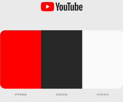
2. Color
|
To make the iconic YouTube Logo, the brand has maintained certain colors over the decade.
These colors work well across all devices and backgrounds, giving the brand a consistent and dynamic feel. |
(YouTube Classic Color Palate) |
3. Font
|
“YouTube Sans” is the custom typeface created for the platform. It features smooth, rounded letters designed for digital screens. The font complements the logo’s bold icon without stealing the spotlight, keeping everything modern and easy to read. |
 (YouTube Current Font) |
YouTube's Changing Interface and New Icons
Over time, the design & feel of YouTube have been changed significantly. While the previous interface boasted an overly intricate design, the revamped layout is simpler, cleaner, smoother, and easier to navigate for users. Accessible across laptops, phones, and smart devices alike, intuitive organisation allows effortless location and playback of videos.
|
As YouTube added new features, it also brought in small but important icons. One of the biggest changes was the launch of YouTube Shorts. It came with its own YouTube Shorts logo, a red and white “S” shaped play button. Just like the main YouTube logo, these new icons help users understand the type of content at a glance. These small, cool YouTube logos play a big role in YouTube’s design. They keep the platform fresh and easy to explore. With every update, YouTube keeps its design clean and modern, while making sure its logo and icons stay easy to recognize and connect with. |
 (YouTube Shorts logo) |
Wrapping Up
YouTube’s journey is not just about videos, but also about how design helps shape our experience. From its classic red play button to the new icons for YouTube Shorts and other features, every part of its look tells a story.
Even small design changes, like cleaner layouts and tiny logos, have made YouTube feel more modern and easier to use. As the platform grows, its simple yet powerful design will continue to play a key role in keeping it familiar, user-friendly, and iconic.
FAQs
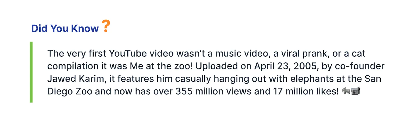
Though the YouTube site was founded on the 14th of February. It was initially available to the public from 23rd April 2005 after one of the co-founders, Jawed, uploaded its first video “Me at the Zoo”.
Jawed Karim, co-founder of YouTube, uploaded the first video to YouTube on April 23, 2005. The video, entitled “Me at the zoo”, features Karim in front of an elephant enclosure at the San Diego Zoo.
The co-founder actually designed the First YouTube Logo. Chad Hurley has a gift for designing and presented the iconic YouTube logo, which is still refreshing and makes the history of YouTube. He was also the one who thought about the user experience of the whole site. The first unofficial YouTube concept had the site name in a bold, red font on a white background.
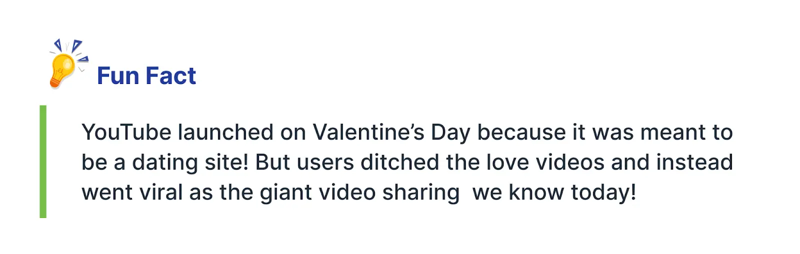
YouTube was launched with its original YouTube logo in February 2005. The platform was created by Steve Chen, Chad Hurley, and Jawed Karim. It was first meant to be a dating site called “Tune In, Hook Up,” but soon became a place to share videos.
The idea came from how hard it was to send videos from a dinner party. The first video, “Me at the Zoo,” was uploaded on April 23, 2005. Google Purchased YouTube in October 2006.
YouTube picked red to make the brand feel bold, exciting, and full of energy. It grabs attention and pops perfectly against a white background.
Web Content Writer
Recent Best Designs
Harshita Toplani
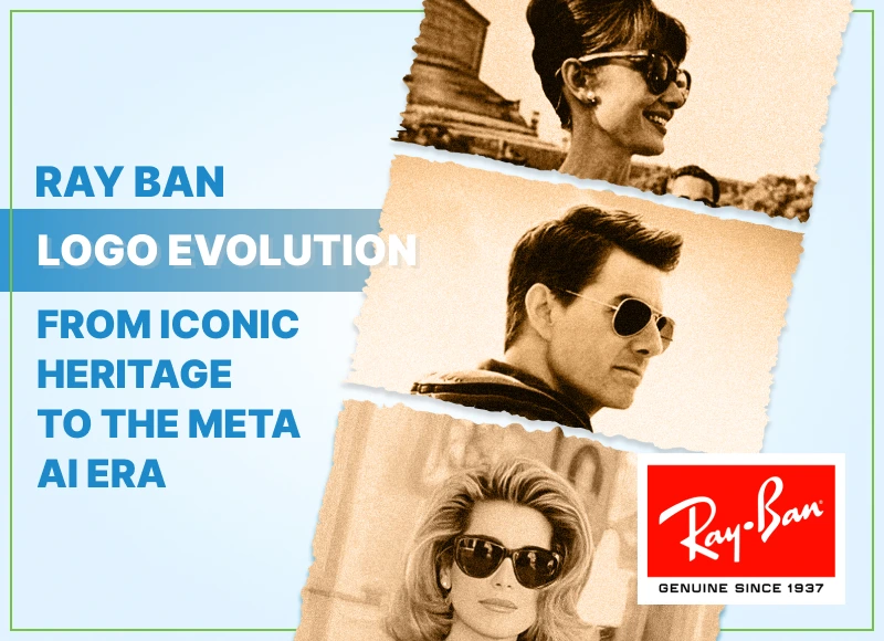
Ray Ban Logo Evolution: From Iconic Heritage to the Meta AI Era
-
04 Sep 2025
-
6 Min
-

7064