- Home
- Best Designs
- Logo
- Starbucks Logo – A Siren of Global Coffee Culture
Starbucks Logo – A Siren of Global Coffee Culture
-
Last Updated:

16 Jun 2025
-
Read Time:

4 Min Read
-
Written By:
 Harshita Toplani
-
6046
Table of Contents
The Starbucks logo, a green twin-tailed siren, has transformed from a mythological symbol into a global icon, reflecting comfort, quality, and a welcoming coffeehouse culture recognized across continents.
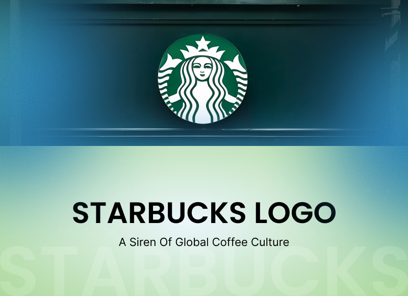
Only a few logos globally are as instantly recognized as the green, twin-tailed siren that glorifies every Starbucks cup. With over 45,000+ outlets worldwide, Starbucks has evolved into a cultural icon.
Its logo is a visual shorthand of what the company represents: comfort, quality, and a worldwide coffeehouse experience. The siren doesn’t need text or explanation. It speaks a universal design language, becoming a beacon for coffee lovers across continents.
Logo Origins
Starbucks' original logo was brown and written "Starbucks Coffee, Tea, and Spices" surrounded by a circular ring around the siren. It had a bare-breasted siren dressed in a medieval gown and was both visually and textually dense.
As the business expanded over time, the previous Starbucks logo underwent changes. Starbucks simplified the siren's shape while preserving the maritime theme in 1987 and used a green color scheme to symbolize growth and freshness.
People are also curious about the Starbucks logo's hidden meaning, though it is about a 16th-century Norse woodcut. The two-tailed mermaid is what it reflects on the logo. She is a mythical siren who is famous for seducing sailors through singing. This enchanting picture seemed just right for a company that aimed at attracting people with unusual coffee flavors.
By 1992, the siren had been zoomed in, with focus placed on her face and hair, making the design more attractive. The most noticeable change occurred in 2011, when Starbucks completely deleted the wordmark, leaving the siren to speak for herself.
Looking to uncover how top brands evolve through design? Discover expert branding agencies featured on SelectedFirms, where strategy meets aesthetics.
What is the significance of the Starbucks logo?
The siren is more than simply a reference to nautical mythology. She exemplifies the brand's goal of providing a sensual, nearly mystical experience. The siren is intriguing, but not in the conventional sense. She welcomes rather than demands, enticing people with warmth, familiarity, and a touch of mystery in the Starbucks logo.
Green was chosen as the primary hue on purpose. Green represents growth, energy, and environmental consciousness, values that Starbucks has long sought to promote via its sustainability programs.
It also draws on colour psychology to convey serenity, balance, and harmony. When people see the green siren, they do not simply think of just the regular Starbucks logo, which provides coffee. They think of a daily ritual, a welcoming space, and a moment to themselves.
Visual of the Starbucks Logo Explained
The history of the Starbucks logo represents not only changes in design trends but also an increasing confidence in the brand's identity.
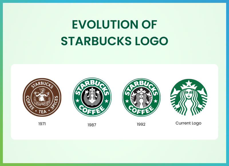
- 1971: The original Starbucks logo of 1971 featured a full-body siren, a brown color palette, and detailed text. It was rooted in tradition and heavily emphasized the brand’s coffee origins
- 1987: The shift to green marked a rebranding effort under new ownership. The siren remained, but she was stylized and partially covered, and the words around the ring were modernized to "Starbucks Coffee."This 1987 Starbucks logo gave huge significance and made it specialized for the coffee store.
- 1992: A tighter crop on the siren brought focus to her face, crown, and flowing hair. It was cleaner, bolder, and easier to reproduce on various media, which made it a part of Starbucks' logo history.
- 2011: In the journey of the Starbucks logo evolution, the company dropped its brand name entirely. The siren was now unframed and centered. This minimalist approach signaled supreme brand confidence—they didn’t need words anymore. The symbol alone did all the talking.
Each iteration refined the logo without losing its core identity. The siren endured while the Starbucks logo design became more versatile and modern.
Real-World Use of the Starbucks logo
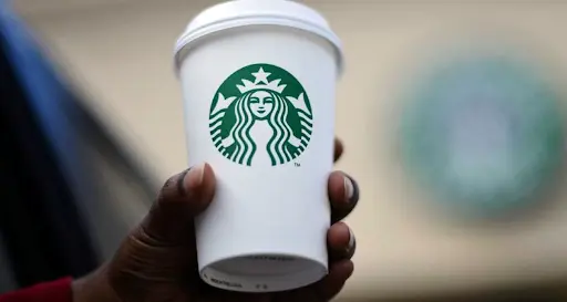
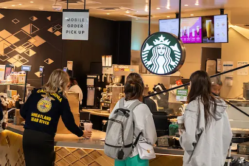
The siren appears everywhere—on cups, store signage, digital apps, and an ever-growing range of merchandise. What’s impressive is how the logo adapts across formats without losing integrity. It’s scalable, monochrome-friendly, and instantly identifiable, whether embossed on a stainless steel tumbler or glowing on a drive-thru sign.
Starbucks has also mastered seasonal and cause-based branding without straying from the core identity. The infamous red holiday cups replace the white background to signify festivity and warmth.
For Pride Month, rainbow elements often accent packaging and social media assets. Earth Day might see a more eco-conscious aesthetic. These variations keep the Starbucks brand culturally responsive and relevant, while the siren always anchors the experience.
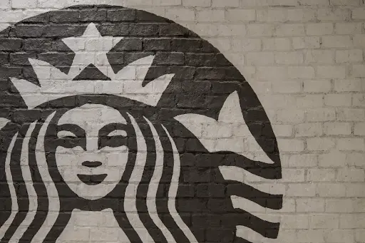
Starbucks Logo Design InsightsAt first glance, in the Starbucks Original Logo, the siren seems simple. But designers know that the logo’s power lies in its complexity. |
|
|
|
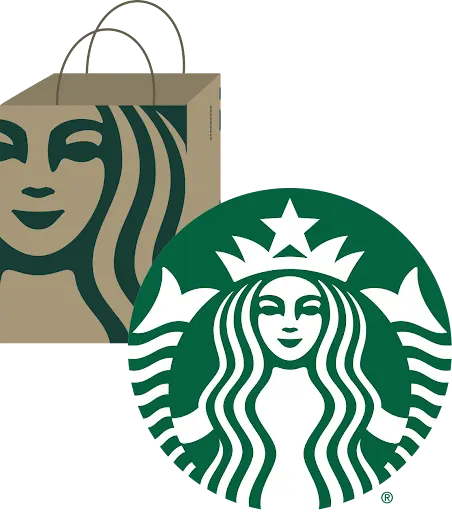
Her face is symmetrical, serene, and human-like, creating a sense of trust. The logo is a case study in balance between heritage and modernity, complexity and clarity. Even when stylized for different uses (metallic logos for premium lines, simplified stamps for eco-packaging), the essence remains intact. Starbucks has kept its branding consistent by sticking to core elements: the siren, the green, and the sense of calm invitation. |
Cultural Symbol: Meaning behind the Starbucks logo
The Starbucks siren is more than a logo; it’s a cultural artifact. It means more than just coffee. It indicates an urban, fast-paced, socially concerned, community-oriented lifestyle.
Every major town has a Starbucks that functions as a workspace, gathering spot, or home. Countless films, television programs, and memes include the Starbucks logo as a backdrop. It shows up in hands-on busy sidewalks, in airport terminals, and in social media selfies. It’s shorthand for modern life.
Starbucks has leaned into this symbolism. They don’t just sell coffee; they sell an experience, a sense of belonging. The siren, with her mysterious smile, is the Starbucks logo of that promise. Her omnipresence makes her one of the few corporate symbols that feels personal and communal at once.
Wrapping Up
The Starbucks siren has journeyed from an obscure Norse illustration to one of the most recognized logos on the planet. Through deliberate design evolution and consistent symbolism, she’s become more than a brand mascot. She’s a global symbol of connection, routine, and lifestyle.
In an age where attention spans are short and logos come and go, the siren endures. She doesn’t just lure coffee lovers—she welcomes them, day after day, cup after cup.
Explore how industry leaders are reshaping design with purpose. Visit SelectedFirms and connect with world-class agencies shaping tomorrow’s brand stories.
FAQs
The ocean, symbolizing journey and the travel of coffee around the world, is the origin of the meaning of the Starbucks logo. The siren symbolizes comfort, warmth, and enticement. It also symbolizes Starbucks' roots in Seattle, a seaport, by identifying with tradition, adventure, and the comforting aspects of coffee.
Starbucks decided to use a mermaid, or siren, to represent the attractiveness of coffee because sailors were attracted to fabled sirens while at sea, and it was intended to attract customers.
The origin of the Starbucks logo is the world journey of coffee, and the port city of Seattle's roots. The siren intermixes mythology and promotion to render the brand memorable and emotionally engaging.
She is not an actual person; instead, she is an ancient mythological twin-tailed siren. Starbucks employs her as a symbol of beauty and craving to render their coffee as unique, exotic, and welcoming.
Web Content Writer
Recent Best Designs
Harshita Toplani
Ray Ban Logo Evolution: From Iconic Heritage to the Meta AI Era
-
04 Sep 2025
-
6 Min
-

7366