- Home
- Best Designs
- Logo
- Amazon Logo Evolution & Design Analysis – From Bookseller to Global Empire
Amazon Logo Evolution & Design Analysis – From Bookseller to Global Empire
-
Last Updated:

09 Jun 2025
-
Read Time:

5 Min Read
-
Written By:
 Jane Hart
-
8002
Table of Contents
A deep dive into the Amazon logo’s evolution, meaning, and design strategy, and how a simple arrow became one of the most powerful brand symbols in the world. Plus, tips for crafting logos that work.

Amazon began in 1994 as an online bookstore run from Jeff Bezos’ garage. But it didn’t stay small for long. Within a few years, it expanded into music, electronics, and just about everything else, quickly becoming “the everything store.” As Amazon grew into a global giant spanning eCommerce, cloud computing, and AI, its branding evolved too.
At the center of that journey is the Amazon logo, a design that tells the company’s story with just a few letters and a curved arrow. It’s a quiet icon of one of the loudest business success stories in modern history.
Logo Origin Story
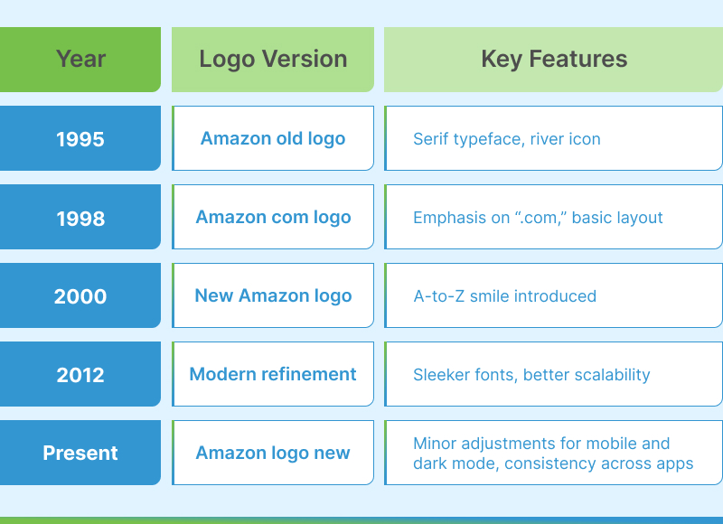
Before the Amazon A to Z smile, the Company's original logo was far more literal. In 1995, the company launched with a simple, river-inspired wordmark meant to evoke the vast Amazon River, symbolizing scale and abundance. It included a stylized “A” overflowing water, making it look more like a regional courier than a tech-driven powerhouse.
In 2000, everything changed. Enter the Amazon.com logo we recognize today: clean typography with a curved yellow arrow stretching from “A” to “Z.” This marked the company’s shift from a bookseller to “the everything store.”
Turner Duckworth, a design agency known for bold, lasting brand marks, led the redesign. Their brief? Curate and design a logo that speaks of friendliness, global reach, and the promise that you can find everything, from A to Z, on Amazon.com.
Evolution Timeline
The Amazon logo has gone through a striking evolution, mirroring the company's journey from humble online bookseller to multi-industry empire.
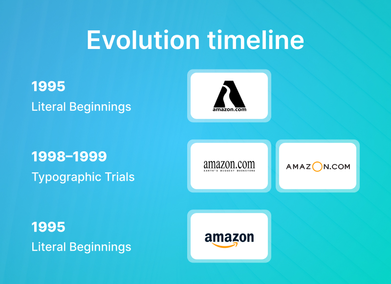
1995: Literal Beginnings
Amazon's first logo featured a large, uppercase “A” over a winding river. It was inspired by the Amazon River and meant to suggest scale, exploration, and vast inventory. This logo representation was ambitious but lacked versatility and polish.
1998–1999: Typographic Trials
Jeff Bezos is known for experiments, and of course, he experimented with several typographic logos, emphasizing the URL, amazon.com, to drive traffic and brand familiarity. These versions used plain serif fonts and often included taglines like “Earth’s biggest bookstore.”
2000: The Game-Changer
In a major important rebranding, Amazon revealed the Amazon arrow logo we see today. Designed in collaboration with Turner Duckworth, the new logo was introduced:
- A lowercase, approachable “Amazon”
- A yellow arrow stretching from “a” to “z”
- A hidden smile beneath the surface
This change coincided with Amazon’s strategic move into broader retail categories. The new logo told customers: “We’ve got everything—from A to Z—and we’ll deliver it with satisfaction."
Logo Meaning & Symbolism
The genius of the Amazon logo lies in its visual double entendre.
- The arrow isn’t just decoration or some aesthetic design. It forms a smile, reinforcing Amazon’s promise of a satisfying customer experience.
- The arrow’s span from “A” to “Z” is a direct nod to the company’s massive inventory, whether you're buying paperclips or patio furniture, Amazon has it.
- The curve of the arrow injects personality, softening the utilitarian font and humanizing the brand.
Typography
Amazon switched to Amazon Ember, a custom sans-serif typeface designed for clarity and digital display. It’s geometric, clean, and legible on a billboard or smartwatch.
Color Psychology
- Black: Confidence, stability, authority
- Orange/Yellow: Energy, friendliness, enthusiasm
This blend gives the Amazon logo a unique duality: professional enough for enterprise (AWS, Amazon Business) but warm enough for everyday shoppers.
Usage Across Platforms
The Amazon brand symbol is engineered for omnipresence. Many people are unaware that it looks great on a 50-inch TV, a 5-inch phone screen, or a 2-inch shipping label. Be it any device, it will look amazing.
Mobile & App Icons
The Amazon logo icon for mobile uses just the “a” and the curved arrow for a compact, brand-consistent look.
Packaging
Amazon boxes are intentionally designed as mobile billboards. The smiling arrow shows up on everything from tape to box sides, turning each delivery into free advertising.
Hardware Products
Whether it’s a Kindle, Echo, or Fire TV Stick, the logo or its elements appear subtly, building trust.
Ecosystem Brands
Amazon Prime, AWS, and Amazon Music adapt the logo’s core identity but customize typefaces or layouts to fit niche platforms, all while preserving the core DNA.
Seller Ecosystem
The Amazon seller logo also retains the smile, signaling official partnerships and merchant credibility.
Cultural Impact & Popularity
The symbol of Amazon has become part of our visual vocabulary. It’s natural for us to recognize it even if it’s visible from afar.
- Customer Loyalty: That curved arrow reassures millions of customers that reliability is just a click away.
- Brand Equity: It’s a small Amazon logo but carries massive weight in global trust rankings.
- Pop Culture Presence: From memes to TikTok, the logo is frequently parodied, adapted, or spoofed, yet always unmistakable.
- Controversy & Change: In 2021, Amazon updated its app icon. Some users felt the original design resembled Hitler’s mustache, leading to a quick tweak. This incident sparked a wave of searches for “why Amazon logo changed” or “Amazon logo issue.”
Design Breakdown
Let’s get into the design mechanics that make the logo tick.
- Font – Amazon Ember: Built for modern readability. Balanced letterforms, consistent width.
- Arrow Dynamics: The stroke thickness, angle, and curve are precisely calculated to balance the heavier text.
- Whitespace: Carefully distributed to avoid clutter and enhance legibility at any size.
- Balanced: It retains its integrity from the Amazon white logo on dark mode screens to the Amazon logo HD on 4K displays.
How to Create a Successful Logo Like Amazon's
If you're designing a brand logo, whether you're launching a startup or rebranding, here are key takeaways from Amazon’s logo success:
Keep It Simple, But Meaningful
Brands generally overcomplicate things, get too much into details, hence avoid overcomplication. One clever visual twist, like Amazon’s A-to-Z arrow, can be more memorable than five gradients or symbols.
Design for Versatility
Your logo must work on screens, boxes, billboards, and app icons. It should always look great on all the devices. Always test at micro and macro scales.
Use Emotional Signals
Colors and curves matter. Amazon's curved arrow adds warmth to a strong font. Small design choices make people feel.
Think Long-Term
Good logos endure for a longer time and create an impression instantly. Amazon has kept its core mark for over 20 years, tweaking only what’s necessary.
Tie It to Your Promise
Amazon’s arrow isn’t random—it aligns directly with their value proposition. Make your logo say something about who you are.
Need expert help to craft a brand that lasts? Check out our curated list of top branding companies.
Final Thoughts
The Amazon changed logo didn’t just keep up with the changing times, it helped define them. With subtle design, bold symbolism, and smart usage, the Amazon image logo delivers on more than one promise. It’s a logo that sells trust before clicking “Add to Cart.”
And it’s not just a design triumph, it’s a business asset.
Looking to Build a Logo with the Same Impact?
If you’re a business leader, startup founder, or eCommerce seller looking to design a logo that actually works, SelectedFirms can connect you with world-class logo design companies that specialize in powerful, strategic identity design. Skip the fluff, get results.
Head Of Digital Marketing
Recent Best Designs

Harshita Toplani
Ray Ban Logo Evolution: From Iconic Heritage to the Meta AI Era
-
04 Sep 2025
-
6 Min
-

7434