- Home
- Best Designs
- Logo
- Ford Logo – Heritage of Automotive Identity
Ford Logo – Heritage of Automotive Identity
-
Last Updated:

13 Jun 2025
-
Read Time:

6 Min Read
-
Written By:
 Harshita Toplani
-
4177
Table of Contents
Not every brand gets remembered, but Ford does. The Ford logo tells a powerful story of endurance, innovation, and legacy that continues to drive trust and recognition in every vehicle it proudly represents.

The world has witnessed a lot of automotive brands being launched and getting lost in the crowd, as if they never existed, but only a few automotive brands have achieved the iconic stature of Ford. Founded in 1903 by Henry Ford, the company changed and gave a new definition to transportation with the assembly line and made cars accessible to the masses.
However, alongside its engineering achievements, Ford built something intangible, a brand identity that is known to be powerful. The Logo of Ford Motor Company is central to that identity, simple, recognised, and rooted in over a century of industrial and cultural change.
(Ford Logo PNG)
The blue oval is more than simply a beautiful sign or symbol; it represents trust, legacy, and American perseverance.
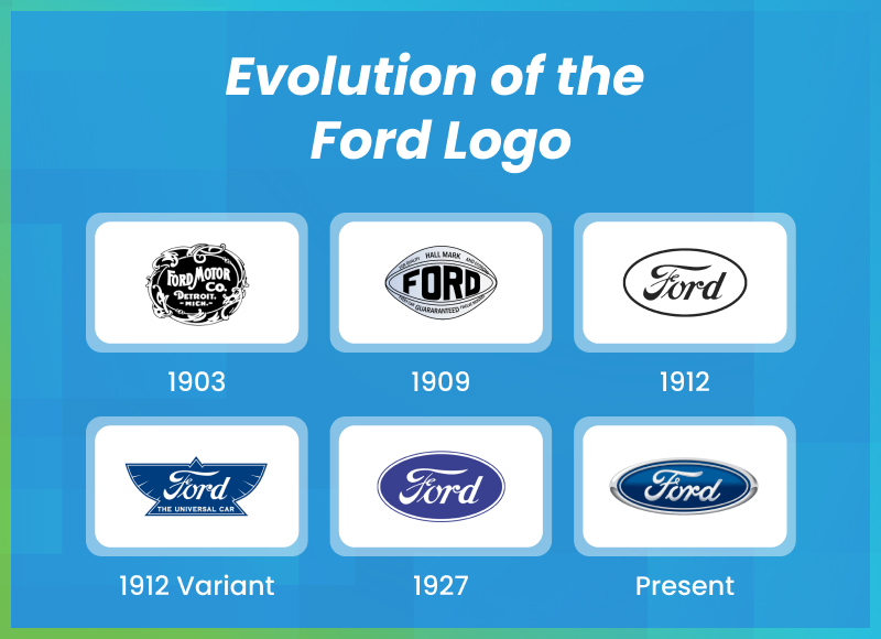
Historical Overview- From 1903 to the Present
The Ford logo has travelled a long way. When the company was founded in 1903, branding was not the mastered science that it is now. The Original Ford logo manifestation had an elaborate Victorian-style crest with Art Nouveau inspirations that was aesthetically pleasing and useful, which forces it to be a part of the history of Ford logo.
By 1907, the now-famous Ford script started to catch attention. It was based on Childe Harold Wills’ handwriting, an early associate of Henry Ford. It gave such a more personal, handcrafted feel that stood in contrast to the rigid, mechanical serif fonts used by competitors.
However, it wasn’t until 1927, coinciding with the release of the Ford Model A, that the now-familiar blue oval frame was introduced. This marked a turning point, giving Ford a cohesive and modern brand signature.
Since then, while the design has evolved through refinements in color, proportion, and font style, unlike other brands, it has never lost its core identity. Through decades of market shifts, various tech revolutions, and changing consumer tastes, the logo has stayed relevant, which is quite a rare achievement in any industry.
Meaning Behind the Elements of Ford Logo Design
The strength of the Ford logo lies in its intentional simplicity. It’s the key to everyone’s heart. It’s like a universal truth that every design choice reflects a core value of the brand:
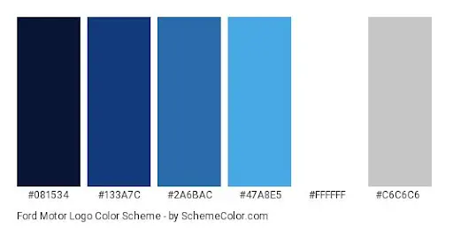
1. Blue ColorBlue isn’t just a corporate-friendly color; it’s a psychological signal. The specific deep blue used in the Ford oval conveys:
2. Script Typography
The script in the Ford logo isn’t a generic cursive; it’s derived from a personal signature. This lends the brand a human dimension, connecting innovation with craftsmanship. Unlike bold sans-serifs used in modern tech logos, Ford’s flowing script evokes legacy, pride, and a continuity of vision. |
(Source: Pinterest) |

3. Oval Shape
The oval itself, introduced in 1927, serves as a visual container—a frame that stabilizes and elevates the script. It brings structure to the softness of the type, creating a harmonious balance between formality and flair.
Evolution of the Ford Logo Timeline
Here’s a breakdown of how the Ford Motor logo evolved over the decades:
- 1903–1909: The original logo was a black-and-white decorative border surrounding the words “Ford Motor Co.” in a complex serif font. It resembled a Victorian business card more than a modern logo.
- 1909: The introduction of the script-style “Ford” started to define the brand's personality. It was elegant, informal, and visually remarkable and different.
- 1912–1927: A version of the script appeared inside a winged triangle and later a more stylized oval. These versions were transitional, bridging the old ornate style with the cleaner modern look.
- 1927: The blue oval with the white script became official with the launch of the Model A, signaling Ford’s step into a more unified brand identity.
- 1927–1976: Various refinements were made to the logo’s proportions and tones, but the core stayed consistent. The introduction of chrome effects during this time aligned the badge with the automotive design trends of the era.
- 2003 (Centennial Edition): A sleek, updated version was released on Ford’s 100th anniversary. This new Ford logo added depth and shine to the oval, giving it a 3D, digital-ready finish that remains in use today.
These Ford logos have not just changed over the years, but it's the mark of growth
Use of Ford Symbol Across Models & Marketing Campaigns
The logo of Ford Motor has been a constant on every vehicle, brochure, and commercial for nearly a century. Its placement on grilles, steering wheels, tailgates, and dashboards serves both functional and emotional purposes—it reassures buyers of quality and heritage.
To maintain the emotional attachment with effective marketing, the Ford logo has also evolved over time based on different car models, with unique emblems that reflect the character of each vehicle. Some of their most iconic car logos include:
- Ford Mustang Logo – The iconic galloping horse symbolizes speed, freedom, and American performance culture, giving the Mustang its essence.
- Ford Truck with Skull Logo – A bold, custom design Ford logo often used in aftermarket or special editions, representing toughness and rebellious spirit.
- Ford Bronco Logo – The bucking bronco emblem captures ruggedness, off-road adventure, and untamed wilderness.
- Ford Raptor (F-150 ) Logo– The aggressive Raptor lettering conveys extreme off-road capability and high-performance engineering.
Print Design Agencies believe that the blue oval acts as a stamp of authenticity. Whether it’s print ads from the 1940s or augmented-reality billboards today, the logo scales effortlessly across formats and platforms.
It's obviously the time of electric automobiles and futuristic branding, companies such as Tesla and Rivian choose simple, almost anonymous logos.
On the other hand, Ford is still iconic. It keeps its traditional style while adding electric vehicles like the Mustang Mach-E and the F-150 Lightning. The Ford Vintage logo connects these innovations to a trusted history, providing consistency for upcoming changing years.

Design Breakdown Ford Emblem: Structure, Typography, and Variants
Typography
The Ford Logo Font is a custom, cursive logo type with roots in calligraphy. Unlike mass-market typefaces, it conveys personality. The loops, swashes, and descending strokes give it motion, perfect for a brand rooted in transportation.
Oval Construction
The oval varies subtly depending on its use:
- On vehicle badges, it often appears metallic or chromed, reinforcing the sense of craftsmanship.
- In digital and print, it may be rendered flat or with slight gradients for clarity and readability.
Font vs FormFord resists trends like geometric minimalism. This makes it stand out in a sea of stripped-down, hyper-modern emblems. Instead, the Ford emblem embraces curves and emotional resonance. |
 |
Emotional Value: More Than a Logo
The Ford symbol has a unique significance in American culture. It has been present during world wars, economic upheavals, and generational milestones. For many, it’s not just a Henry Ford's symbol of car brand. It’s:
- A link to family history (the truck dad drove, the Mustang you saved for)
- A symbol of ingenuity (mass production, the moving assembly line)
- A blue-collar badge of honor (from farmers to factory workers)
Even globally, the logo represents American innovation and perseverance. It evokes emotion, not just recognition.
A Legacy Sealed in Blue Ford Logo
The Ford logo is more than a company trademark; it is a visual representation of trust, consistency, and identity. Despite over a century of change, it has managed to grow without losing its identity and has made the history of the Ford logo. It proves that good branding, rooted in sincerity, can withstand any crisis.
If your brand needs a logo that doesn’t just look good but stands the test of time, SelectedFirms can connect you with the creative logo design agencies who know how to deliver.
FAQs
The Ford logo shows a blue oval with the word "Ford" in a handwritten style. The Ford logo, standardized by its blue color, signifies trust and quality. The script connects to the company’s history. The oval shape adds a sense of strength and ties the brand to cars and movement.
The Ford logo, designed by Childe Harold Wills, represents the company's long history, trust, and quality. The Model A was the first to use the blue oval shape and script in 1927. It demonstrates Ford's commitment to continuing to produce cars that function and advance the industry.
Indeed, Ford's logo has evolved over time. It was merely a handwritten script in 1903. An oval form was added in 1907. In 1976, the blue oval became the norm. Updates since 2017 have removed the inner white border and made the design flatter and simpler.
The Ford Mustang has a running horse logo that shows its sporty, American personality. This symbol makes it stand out from other Ford cars by showing freedom and energy. It makes the Mustang stand out as a unique, performance-oriented car.
The Ford logo uses a custom script based on Henry Ford’s signature, inside a blue oval symbolizing strength. It isn’t a standard font, though some say it looks like Eurostile Black Extended. Ford also uses the “Ford Antenna” font in its corporate materials and branding.
Web Content Writer
Recent Best Designs


Harshita Toplani
Ray Ban Logo Evolution: From Iconic Heritage to the Meta AI Era
-
04 Sep 2025
-
6 Min
-

7365