- Home
- Best Designs
- Logo
- Instagram Logo - History, Evolution, and a Trendsetter
Instagram Logo - History, Evolution, and a Trendsetter
-
Last Updated:

11 Jun 2025
-
Read Time:

5 Min Read
-
Written By:
 Harshita Toplani
-
5603
Table of Contents
Discover the fascinating journey of the Instagram logo, a symbol that has evolved into a global icon. This product delves into the history and transformation of the logo, showcasing its role as a trendsetter in the digital age.
Instagram is more than just a social app; it's where global trends take shape. From viral dances to creative reels, it inspires over 2 billion users daily. Its vibrant gradient logo stands as a symbol of modern expression, creativity, and connection.
Do you have a curiosity to dance and make videos on the trend, and upload them to social media to participate in the trend? Where would you like to upload it? Of course, the official trendsetter and one of the biggest known and popular platforms on “Instagram”.
This platform has become the go-to social media for people of every age, from Millennials to Gen Alpha. And now has more than 2 billion users worldwide.
Instagram - “The Trendsetter”
Instagram is known for its creative way of sharing photos, videos, and features like interactive filters. This makes it the most popular social media platform. Now have more than 2 billion users globally. The current iconic gradient logo reflects the vibrance, creative spirit of the app, and serves as the symbol of digital culture and self-expression.
Instagram has come a long way and has been like a storm. The Popularity of it among the people has been crazy. This platform has become a medium for showing their emotions, whether they are happy, sad, motivated, proud, or tired of the real world.
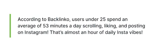
(Source: Backlinko)
Let’s understand the detailed Instagram logo design, how it has come a long way, and the history of the Instagram logo.
History of Instagram
Instagram began in 2010 when Kevin Systrom and Mike Krieger launched it as a photo-sharing app in San Francisco. The name was kept as a combination of “instant” and “telegram”. It started out as a check-in app called Burbn but quickly shifted focus to photos.
Their idea was simple: a platform that allowed iOS users to share square photos of 640 pixels, which matched the iPhone’s screen width at the time. The concept was easy to love. People could share square photos, add fun filters, and interact with others through likes and comments. Within just two months, Instagram had over a million users.
In 2012, Facebook noticed its rapid growth and bought the app for around $1 billion. This deal changed the lives of both founders and helped take Instagram to a much bigger scale.
As the platform grew, it added new features like Stories and later, Reels. Reels became especially popular, letting users create short and entertaining videos that caught massive attention.
Today, Instagram has over 2 billion monthly users. It has become a space for creativity, connection, and self-expression for people around the world.
Design of the Instagram logo
The Instagram logo is a perfect example of how a simple design can still feel exciting and energetic. It gives off fun, creative vibes while staying sleek and minimal.
(Source: Wikipedia)
When Instagram decided to update its logo and give it a bright look. Lead designer Ian Spalter took it as a challenge to keep the logo modern while keeping the charm of the original design. As they understand that with the old camera icon, the user already had an attachment, they would make sure to keep that attachment alive in the new design.
The updated Instagram logo in png, introduced in 2016, features a clean white outline of a camera placed on a bright gradient background that shifts from pink to orange to purple. This change was bold, moving away from the detailed vintage-style camera to something more abstract and adaptable for the digital age.
The new look of the Instagram logo was created to stand out in app stores, on screens, and across platforms, while still being instantly recognizable.
The gradient colors symbolize creativity, energy, and the endless flow of content that users share every day. The camera shape, though simplified, still reminds users of Instagram’s roots in photo sharing.
Ian Spalter and his team have taken it as a challenge to create a logo that feels new, fresh, and forward-thinking while keeping the historical app's dignity. The present Instagram logo is not just a regular design; it is a symbol of modern, creative, colourful expression with a global connection.
Instagram Logo Evolution
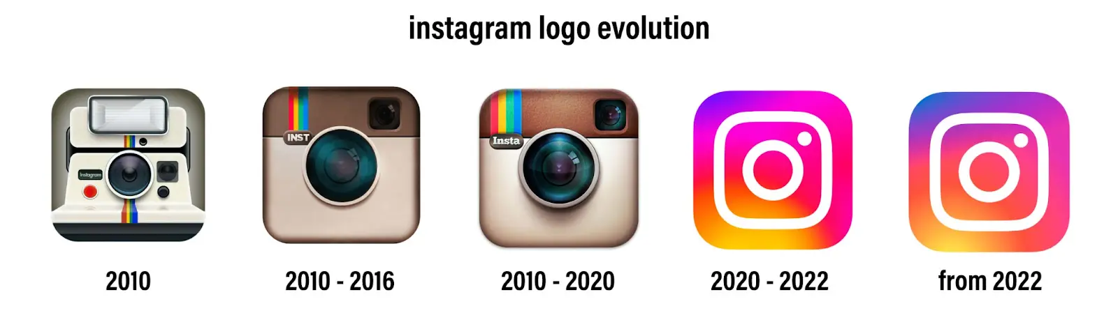
(Source: 1000logo)
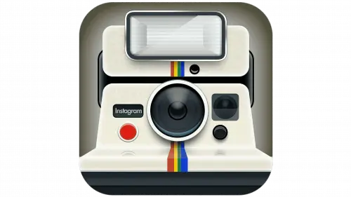
The First-Original Logo Of Instagram (2010)
At the time Instagram launched, the first original logo was designed by the co-founder Kevin Systrom in 2010. The original Instagram logo contains a retro-styled Polaroid camera with a rainbow stripe, capturing the vintage vibe of the 80s. The design shows the features, as the app was all about sharing photos and adding creative filters.
(Source: Fast Company)
The original logo had a rounded square shape, which fit well as an app icon. The word “Instagram” was inscribed in a tiny Instagram logo’s font on the left side of the camera.
While it looked more like an image than a polished brand symbol, the rainbow stripe and camera shape quickly became memorable. It stood out from other social media icons and gave the app a unique, creative identity right from the start.
However, the founders soon faced issues with trademarks and realized the logo needed a professional upgrade that could evolve with the app's growing popularity.
Despite being short-lived, the original design sparked a new era for visual branding on mobile platforms. It was more than just a logo—it represented a new way of capturing and sharing moments, laying the foundation for Instagram's iconic look today.
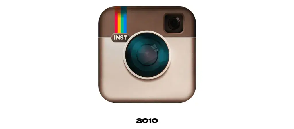
Redesigned the old Instagram logo (2010-2011)
Even after facing legal trademark issues, Instagram has become popular among people. It has not only been the source of sharing photos but also videos.
Soonly. Founder Kevin Systrom realized that the original Polaroid-inspired logo needed a more refined and timeless look. To take things up a notch, he reached out to Cole Rise, a professional photographer, designer, and early Instagram beta tester.
Inspired by the classic Bell & Howell camera from the 1950s, Rise began designing a new logo. He created a version that kept Instagram’s creative spirit but looked more modern and polished.
(Source:Logosworld)
The second version of the logo featured a beige and brown color scheme, similar to the original, but with deeper shades and sharper detailing. It focused more on the lens, enlarging it to become the center point of the design.
The camera icon included a small viewfinder in the top right and the now-familiar rainbow stripe in the upper left. Underneath it, the abbreviation “INST” was written in a clean, sans-serif font, giving it a sleeker, more balanced appearance.
This version of the logo stood out not only for its nostalgic feel but also for its adaptability. It looked good at different sizes and was better suited for a fast-growing digital platform.

The design captured the essence of photography while moving away from the limitations of the Polaroid concept. It was simple, stylish, and became Instagram’s first widely recognized emblem, marking a major step in the brand’s visual journey.
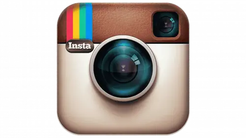
Realistic and Subtle Redesigned Instagram (2011-2016)
The Third Iteration of the Instagram Logo gave Instagram a minimal & subtle look. By refreshing the viewfinder of the Instagram logo, the designer Rise gave a decent view for the people.
As Instagram continued to rise in popularity, especially after being featured on the Apple App Store’s homepage, the logo underwent another subtle but refined update. Still led by Cole Rise, this third version aimed to polish the existing design without making drastic changes. The overall layout stayed the same, but the details were enhanced to create a more realistic and visually rich appearance.
(Source: HiClipart)
This updated logo featured a leathery texture at the top of the camera icon, adding a tactile feel. The lens was refined with a glossy gradient, giving it more depth and a lifelike shine.
The colors on the camera body were made more vibrant, and the contrast was increased to make the design pop. The rainbow stripe on the top left was made wider and more distinct, now consisting of red, yellow, green, and blue in bold strokes.
Another noticeable change was in the text. The uppercase “INST” was replaced with “Insta” in title case, using a bold serif font to make it more stylistically balanced.
These tweaks might seem minor at first glance, but together, they gave the logo a more realistic and polished feel. This version marked the end of the detailed camera-era logos before Instagram would shift to its iconic modern gradient design.

Colored - Finished & Gradient Logo of Instagram (2016)
In 2016, Instagram came up with a completely new logo design that instantly caught everyone’s eyes. The detailed, subtle Instagram camera icon was replaced with a bright, colourful gradient background & a simple white outline of a camera.
(Source: Medium)
This big move started a new chapter of the Instagram platform, which turned out to be more than just a photo-sharing app.
The creative features, such as Stories, Reels, and a growing creator community, Instagram presents a look that shows a dynamic & creative energy.
(Source: Wikipedia)
The updated design kept the familiar rounded square shape but embraced a more abstract and minimal style. The rainbow, once a small accent, now filled the background with vibrant shades of pink, orange, and purple. The camera icon was simplified into clean white lines, with a central circle for the lens and a small white dot in the upper corner. The logo no longer included any text, focusing purely on bold visual elements.
{Source: X (Twitter)}
Though initially, the redesign had mixed reactions, sooner or later, it became a greatly recognizable icon of modern digital culture. Its clear look, warm colors, and simple form make it versatile and easy to connect. Today, this logo represents Instagram’s journey from a photo app to a global hub for storytelling, trends, and creativity.
Refreshed version of the Instagram logo (2022- Present)
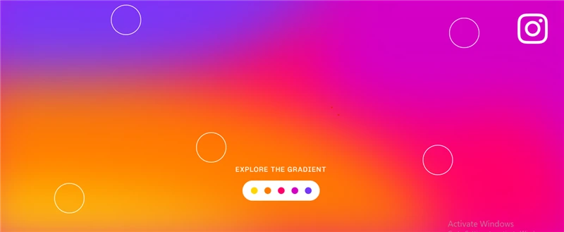
In May 2022, Instagram gave its logo a refreshed look while keeping the core design from 2016. The familiar white camera outline on a colorful gradient background stayed the same, but the colors became lighter and more vibrant. This update added a new sense of energy and brightness, making the icon appear even more dynamic and modern.
(Source; Wikipedia)
The new gradient blends warm tones like gold, pink, and purple in a way that feels almost illuminated. The colors now shift more like light, with yellow starting near the center and stretching downward, while pink flows from top to bottom and toward the right. A touch of blue remains in the top left corner, blending into deep purples. This subtle shift in tone gives the logo more depth, creating a soft 3D effect without changing its shape.
Instagram described the change as a way to bring “new energy and purpose” to its brand identity. The redesigned gradient is used across the app to create a unified visual experience that feels more alive. With this update, the logo continues to reflect this evolution of the Instagram logo as a platform that sparks creativity, discovery, and connection.
Instagram Logo Key Elements - Current Design
The new Instagram logo is built on the previous design, but with a bold twist. While it keeps all the main features of the older version, the updated look feels very different and sparked a lot of discussion among users.
Instagram has stayed true to its photography roots by keeping a white outline of a camera in the center. This clean and simple icon fits inside a soft square shape, which is filled with a vibrant gradient of purple, red, and yellow.
Let’s take a closer look at the key elements that make up the new logo of Instagram.
|
|
1. The Logo SymbolAt the heart of the design is a white outline of a camera. It’s minimal, modern, and easy to recognize. The outline includes a circle in the center to represent the lens and a small dot in the top right corner that hints at a flash or viewfinder. This Instagram logo, transparent, keeps the original camera idea alive but in a much simpler form. |

2. The Color Palette
Colour Palette (Source: Instagram_Brand)
One of the most eye-catching parts of the logo is its vibrant gradient. It blends shades of purple, pink, red, orange, and yellow. This colorful mix gives the logo a bright and energetic feel, reflecting the creativity and fun users experience on the platform.
3. The Font
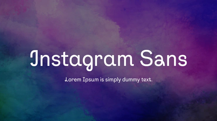
Instagram Sans Font (Source: Cufon_Fonts)
While the app icon itself doesn’t show text, Instagram’s wordmark uses a custom typeface that feels friendly and modern. The smooth curves and clean lines match the overall style of the font of the Instagram logo, keeping everything cohesive and easy on the eyes.
Cole Rise - Who Lived the Instagram Logo
Want to pack all this in a small Journey? Let us give you the ground to know about the Instagram logo Journey from the Eye of a Designer Rise.
When Instagram launched, co-founder Kevin Systrom designed a retro logo that looked like a Polaroid camera—complete with a rainbow stripe. It was nostalgic, but the growing app needed something more refined.
Kevin reached out to Cole Rise, who was inspired by a 1950s Bell & Howell camera. Rise created a polished version in under an hour that became Instagram’s first iconic logo.
The colors stayed warm and vintage, the camera lens took center stage, and we kept the rainbow detail because people really connected with it.
Fast forward to 2016, and Instagram was changing. It wasn’t just about sharing photos anymore. It had grown into a platform for stories, videos, creativity, and connection. The logo needed to reflect that. So Ian, the Head of the design, and his team went for a complete redesign.
Cole Rise expressed positive views on the 2016 Instagram logo redesign. He liked the minimalist approach, the white shape of the symbol, and its potential for long-term relevance.
Rise felt the minimalist design retained the essence of a camera while being visually striking and memorable. People were shocked & criticized at first, but over time, it became part of Instagram’s identity.
In 2022, the logo got a little glow-up. The colors became brighter and more dynamic. The gradient felt alive, like it was made of light. That shift brought even more personality and depth to the brand.
So yeah, from vintage cameras to vibrant gradients, the Instagram logo has been on quite a ride. In this way, Cole Rise was a major part of the journey of the Instagram logo.
Conclusion
The Instagram logo has gone through big changes. From the old-school camera icon to the bright and modern design we see today, each version shows how Instagram has grown. These changes reflect not just design trends but also how the app has evolved in terms of how people use and experience it.
A logo may look small, but it carries meaning. Instagram’s logo stands for sharing, creativity, and staying connected. It’s more than just an image—it’s part of our digital world, so you can hire the top logo design companies that can create a remarkable logo for your business. As Instagram keeps changing, the logo might too, but its impact will always be easy to recognize and remember.
FAQs
The first Instagram logo came out in 2010 when the app launched. It looked like a vintage Polaroid camera. In 2016, it was replaced with the colorful gradient version that’s still in use today.
The first Instagram logo was designed by Kevin Systrom who is the co-founder of Instagram itself. However, the most recognized early version was created by Cole Rise, who is a famous photographer and designer. Later, the bold redesign we see today came from Instagram’s in-house design team.
The logo shows a simple camera outline, which connects to Instagram’s original photo-sharing features. The bright gradient background adds a creative and energetic vibe, reflecting how Instagram is now a place for stories, reels, and visual content.
Instagram uses a custom font called Instagram Sans. It was introduced in 2022 and is now used across the app, website, and marketing. It gives the brand a clean and modern feel.
The colorful icon we see today was created by Instagram’s own design team. They wanted a look that felt fresh and creative, something that matched how the platform had evolved.
Web Content Writer
Recent Best Designs
Harshita Toplani
Ray Ban Logo Evolution: From Iconic Heritage to the Meta AI Era
-
04 Sep 2025
-
6 Min
-

7064