- Home
- Best Designs
- Logo
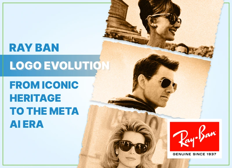
- Ray Ban Logo Evolution: From Iconic Heritage to the Meta AI Era
Ray Ban Logo Evolution: From Iconic Heritage to the Meta AI Era
-
Last Updated:

04 Sep 2025
-
Read Time:

6 Min Read
-
Written By:
 Harshita Toplani
-
7434
Table of Contents
From WWII skies to James Dean’s glare and now the Meta AI era, Ray-Ban Meta sunglasses carry the iconic Ray-Ban logo that has signed off on style for generations.
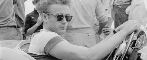
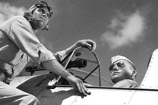
If sunglasses could talk, Ray Ban’s would probably whisper, “I was there before you were cool.” From shielding WWII pilots at 30,000 feet to adding swagger to James Dean’s rebel glare, the brand has not only made eyewear but has made history.
The dark lenses of Ray Ban sunglasses are a star, but just as important is that silky smooth, slanted script that signs off on style with utmost ease. The story of Ray Ban is equally about lenses and letters.
Ray Ban History and Logo Origins
Ray Ban was born in 1937, courtesy of American optical giant Bausch & Lomb, after the U.S. Army Air Corps asked for sunglasses to protect pilots from intense glare. The result was the Aviator—green lenses, lightweight frames, and a mission to ban harmful rays, hence the name “Ray Ban.” The brand didn’t just solve a military problem; it gradually created a style staple.
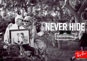
By the 1950s, the Ray-Ban logo was far beyond mere utility and could be called a cultural statement. The Wayfarers, launched in 1952, had made sunglasses a symbol of rebellion and artistry, being donned by everyone from Golden Age Hollywood stars to rock gods. This ever-increasing pop culture presence became a key chapter in the Ray-Ban brand story, imbuing the branding with much more importance and setting the stage for the logo's ascent to an identity emblem.
Evolution of the Ray Ban Logo Design
![]()
1937–1940s
When Ray Ban first appeared, the logo was purely functional. It was a straightforward wordmark, designed simply to identify the product and guarantee authenticity. There was no decorative flourish or marketing play, just a clean label suited to its role as military-grade eyewear for pilots.
1950s–1970s
As Ray-Ban made its way from cockpit to catwalk, the brand started shaping a more distinct visual identity. During this period, the now-famous handwritten-style cursive logo was introduced, granting the brand a personal yet artistic aura. The smooth, flowing letters conjured up images of creativity and individuality, so by means of taste and lifestyle advertising, Ray Ban had moved out of the warnings camp.
1980s–1990s
The logo received subtle refinements to keep pace with modern tastes. Designers adjusted the diagonal tilt, tightened letter spacing, and polished the curves, ensuring the logo felt dynamic yet balanced. The pairing of crisp white lettering on a bright red background became a bold and recognizable brand signature.
2000s–2010s
The application of the logo became more strategic and integrated into product design. It appeared discreetly yet confidently—etched on the upper corner of the lens, printed on the temples, or embossed on cases. Variations in black or other tones ensured the mark complemented different frame styles.
Present Day
The RayBan logo continues to blend heritage with innovation. Anti-counterfeit measures such as laser etching, serial numbers, and holographic details protect the brand’s authenticity. Digital optimization ensures the logo remains sharp and consistent across online platforms. Whether on a classic Aviator, a bold Wayfarer, or the forward-looking Ray Ban Meta AI glasses, the logo stands as a seal of originality, craftsmanship, and cultural cool.
The Ray Ban Meta Logo and Brand Identity
The Ray Ban Meta logo is designed to look stylish, modern, and instantly recognizable. It blends the brand’s classic look with new tech-focused products like the Meta smart glasses. Every detail in the design has a purpose, from the font to the colors and where they appear.
FontThe logo uses a custom cursive style that feels friendly and creative. It looks like a personal signature, which makes it feel authentic and unique. The rounded letters also match the shape of Ray Ban’s famous frames. |
 |
ColorThe main version is white text on a bright red background, which grabs attention and shows energy, confidence, and style. Sometimes the logo appears in black or other colors to fit the product design while keeping the same look. |
 |
PlacementThe logo is usually etched or printed on the upper right corner of the lens and on both temples. This placement is unique to Ray Ban and easy to spot. On Meta smart glasses, the Meta symbol is on the right hinge, and the Ray Ban | Meta mark is inside the charging case. |
|
Brand MessageThe slanted letters make the logo feel lively and forward-looking, while security details like laser etching and serial numbers protect against fakes. The design shows that Ray Ban is both a timeless fashion brand and a leader in wearable tech, with the latest & popular wearables such as Meta Ray Ban smart glasses . |
 |
Timeless Appeal of the Ray Ban Logo
The RayBan logo stays relevant because it blends classic style with modern updates.
- Classic Script – The handwritten design feels personal, authentic, and instantly recognizable.
- Simple and Versatile – Works on any background or material, from red-and-white prints to laser etching on glass.
- Heritage Connection – Seen on classics like Aviators and Wayfarers as well as new products like Ray Ban Meta Wayfarer.
- Cultural Icon – Linked with movie stars, musicians, and fashion moments for decades.
- Modern Adaptation – Updated for digital use, anti-counterfeiting, and tech collaborations, such as the Ray-Ban Meta sunglasses, bring style and innovation together.
Wrapping up
Ray Ban insignia goes way beyond a mere graphic. Indeed, it is a long-lasting symbol of its heritage, authenticity, and cultural influence. Its handwritten script and rather obtrusive placement reflect decades of history and trust, while the logo, being flexible, even fits well in modern contexts like Ray Bans Meta glasses, whilst maintaining its unmistakable identity. As a cultural symbol linked to fashion, music, and cinema, the logo has an appeal that transcends mere branding into its very lifestyle. Continuous updates for security, digital clarity, and tech collaborations ensure it stays relevant, preserving its legacy while embracing the future.
FAQs
The Ray-Ban owner is Luxottica formed in 2018 when Luxottica, which purchased Ray-Ban in 1999, merged with Essilor.
The Ray-Ban origin traces to Italy, where Luxottica’s Agordo factory produces iconic models like the Wayfarer and Aviator. Today, Ray-Bans are also made in China, maintaining identical quality standards across both manufacturing locations.
Look for a clear “RB” etching on the left lens, the Ray Ban script on the right lens, a serial number inside the left arm, and “Ray Ban Made in Italy” with a CE mark on the right arm. All should be sharp and high quality.
It is the brand name in smooth white cursive on a red background, often placed diagonally on the lens with “RB” or “Ray Ban P” etched for authenticity.
The “P” means the lenses are polarized, reducing glare and improving clarity. It is etched next to the logo on the right lens.
A custom cursive font with rounded features, unique to Ray Ban and not available commercially.
Web Content Writer
Recent Best Designs