Table of Contents
Learn how to create effortlessly responsive and mobile-friendly emails with these 5 proven methods. Engage your subscribers across all devices.

Let’s give a round of applause to the 63% of email marketing teams that use a responsive, adaptive, or hybrid design. Kudos also to the 34% who are optimizing their email campaigns for mobile devices.
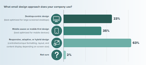
Image Source: Litmus
Even if these numbers were not this promising, we would still stand by the push for mobile-friendly and responsive email templates. As Head of Strategy & Community at Beefree, Justine Jordan, says, "With mobile dominating email opens, failing to optimize emails for all devices can lead to instant unsubscribes. Make sure your emails render flawlessly on every screen!
The takeaway here is clear: if you don't want your audience to ghost you for neglecting to make your emails compatible across all devices, you must join this movement, too!
Responsive and mobile friendly email designs are your best bet for guaranteeing a good email experience for your subscribers, whether they check their inbox on a desktop, tablet, or smartphone.
We also know that email optimization for mobile and other devices isn't always straightforward. This blog will hopefully equip you with some simple yet proven techniques to craft winning responsive and mobile-friendly email campaigns.
Is Responsive Email Design Same as Mobile-Friendly Email Design?
The terms "responsive email design" and "mobile-friendly email design" get thrown around a lot. You might wonder: are they actually two different things, or are they just different ways of saying the same concept?
While they share the goal of ensuring a great user experience on mobile devices, there's a subtle difference. Let’s break it down.
Responsive Email Design
Responsive HTML emails, like a skilled acrobat, adapt and adjust their layout automatically based on the screen size of the device being used—desktop, tablet, or smartphone.
Some key features of responsive emails are–
Fluid Layouts and Media Queries
Uses fluid layouts that automatically adjust the content width based on the screen size. Media queries, a type of CSS code, dictate these adjustments for optimal display across various devices.
Dynamic Font Sizes
Adjusts font sizes dynamically, increasing them for better readability on mobile devices compared to desktop views.
Adaptive Layouts
Can completely change layouts on the fly. For instance, a multi-column layout on a desktop might switch to a single-column layout for better mobile readability.
Platform-specific Element Display
Allows for showing or hiding specific elements based on the platform the email is viewed on. For example, image-based buttons might be hidden on mobile in favor of text-based CTAs that are easier to tap.
Mobile-Friendly Email Designs
Mobile-friendly or scalable designs are tailored for smartphones and tablets, ensuring your message is clear and engaging without complex adjustments.
This approach prioritizes email readability and functionality on smartphones and tablets. The designs usually look the same on mobile devices but are scaled down to about half the size compared to desktops.
Some key features of mobile-friendly emails are–
Fixed-Width Layouts
Utilizes fixed widths, often around 320px–typical phone screen width in portrait mode.
Consistent Font Sizes
Uses consistent font sizes throughout the email, but these fonts are chosen to be large and readable on small screens.
Multi-Column Layouts with Scalability
While some mobile-friendly emails might retain multi-column layouts, these layouts should be designed with readability in mind. Users can still tap and zoom into individual content blocks for easier navigation.
Large, Tappable CTAs
Prioritizes large and clear calls to action (CTAs) with ample space for users to tap on smartphone touchscreens.
Which one should you choose?
Choosing between responsive and mobile-friendly email designs depends on your audience. If they use a variety of devices, responsive design is your go-to. But if they mostly use mobile devices, mobile-friendly might be just what you need.
Whether you choose a mobile-friendly or responsive email design, this blog will equip you with the tools and strategies to achieve both! Ready to dive in? Let’s go!
5 Easy Steps To More Responsive And Mobile-Friendly Emails
1) Use Responsive Email Templates
Responsive email templates are pre-built and optimized to work flawlessly on any device, desktop or mobile. They're highly customizable, allowing you to easily add your brand identity with logos, colors, and images. No coding knowledge required!
Plus, responsive design ensures a consistent brand experience across all devices. This way your emails will always look polished and professional, regardless of where your subscribers open them.
Most email marketing platforms offer a library of built-in responsive templates. You can also explore online marketplaces or design agencies for even more options.
Starting your campaign with a responsive template is a smart move. It guarantees consistent messaging that reflects your brand and saves you valuable time. This saved time can be spent crafting engaging content.
And if you are new to email marketing, templates can be a great learning tool. They showcase best practices and streamline the process, keeping the focus squarely on content creation.
Here are five sources to find high-quality, responsive email templates for various purposes absolutely free:
2) Embrace Single-column Layouts
Most mobile devices have vertical screens, so anything wider, like a multi-column email, ends up getting shrunk. The result? Cramped and hard-to-read email content.
Go for a one column HTML email layout. This design choice ensures your emails look great on any device or email client. With a single-column format, everything stays in the right proportions, making your emails clean and professional without the headache of constantly tweaking the design for smaller screens.
For mobile-friendly emails, ideally stick to a single-column layout between 600-640 pixels wide. This sweet spot offers optimal readability, and if any layout issues arise, they'll be less disruptive on smaller screens.
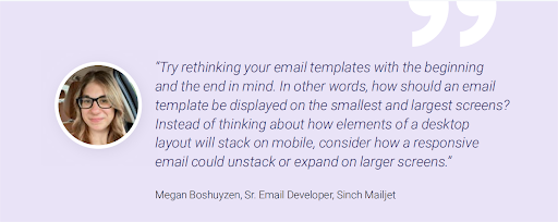
Image Source: Sinch Mailjet
But wait, two-column layouts aren’t all bad news either.
There is a way to create responsive two-column layouts that work well. The key is to avoid complicated styles and use simple HTML attributes to create your layout. HTML attributes, like align="left" and cellpadding="10", are more reliable than their CSS counterparts.
Here’s how it works:
- For Desktop: Set your container width wide enough to fit both columns side-by-side (like 640px). This keeps everything neat and organized.
- For Mobile: If the container width is narrower (like 320px), the right column will wrap under the left column, creating a single-column layout that fits perfectly on a mobile screen without zooming.
This way, your email automatically adjusts based on the screen size, ensuring a good reading experience for everyone, no matter what device they use.
3) Images Work…But Be Careful
Visuals are a fantastic way to add pop and personality to your emails. However, while crafting mobile-friendly and responsive emails, images might become a bit tricky. So, how do you ensure they don't when you craft winning emails for your brand? Here’s how-
- Images That Are Adaptable to Screen Size
If your images are wider than 480 pixels, they can cause horizontal scrolling on smaller screens. It frustrates the readers and reduces engagement.
To avoid this, ensure your images are fluid—they can automatically adjust to different screen sizes. Using an image extender can help maintain visual consistency by filling additional space with relevant background or contextual elements, making wider images more adaptable without compromising layout. Here’s a simple way to do it:
Set your images' maximum width to match their original width. This prevents them from looking stretched or distorted on smaller screens. For example, if your image is 600 pixels wide, set the max width to 600 pixels.
- Alt Text: A Must-Have
Even with the perfect image size, sometimes images won’t display properly. This can happen because of how different email clients handle images or because users have turned off image loading. Solution?
Add Alt Text to your images. Alt Text is a brief description that appears if the image doesn’t load, ensuring your message still gets across. It’s also great for email accessibility, helping visually impaired users understand your content.
Let’s say your email includes a product image that doesn’t load. Having alt text like "Image of our new summer dress collection" saves the day by telling the reader what they’re missing. It also boosts your email's reputation since spammers often skip adding alt text.
- Avoid Image-Only Emails
It's helpful to view images complementing the text rather than the reverse. Rather, creating emails that consist solely of images is a bad idea. These emails often end up in spam folders, and if the images don’t load, your message is completely lost.
Tip: Aim for a text-to-image ratio of 60:40. In other words, instead of an email that’s just one big image promoting a sale, include a headline, some descriptive text, and a few images. This way, if the images don’t load, the text still communicates your message. Here’s an example–

4) Make Your Emails Easy on the Eyes
Regarding mobile-friendly emails, making your text legible and well-structured is crucial. Mobile users can easily feel overwhelmed by tiny fonts and long paragraphs. Here’s how to make sure your message is clear and engaging on any device:
- Content Hierarchy
Clear hierarchy is key on mobile screens. This means prioritizing your content and presenting the most important information first. Think of it like a newspaper headline—the most important details should be clear at a glance, even if someone doesn't read the whole email.
- Keep It Short and Sweet
People are bombarded with emails daily, with 361.6 billion emails sent and received daily worldwide. To stand out, keep your text concise and to the point. Break up long paragraphs into bite-sized chunks for easier reading on small screens. Something like this–
- Text Type and Size
Your email’s text should be easy to read on any device. Stick to standard, email-safe fonts available everywhere, such as Arial, Courier New, Georgia, Helvetica, Lucida Sans, Tahoma, Times New Roman, and Trebuchet MS.
These fonts are accessible on the widest range of computers, devices, and applications, ensuring your text renders correctly whether your recipients use Outlook, Gmail, Android, or iPhone.
Mailjet and Email on Acid recommend a font size of at least 16px to ensure readability on mobile. This size is easy on the eyes and doesn’t require readers to squint or zoom in.
- White Space and Short Paragraphs
Include plenty of white space in the content blocks and design to improve readability on smaller screens.
- Line and Letter Spacing
Consider line and letter spacing when designing your emails. Too much or too little spacing can make email content difficult to read.
For all uppercase text, use letter spacing to prevent the letters from blending into each other. Also, add letter spacing for smaller-than-usual text to ensure readability.
This newsletter from Klaviyo is a great example to learn readability hacks for your email campaigns.
- Short Subject Lines
You want your email subject lines short and snappy to avoid getting cut off on mobile devices. Aim for 40-60 characters to keep them fully visible and compelling.
But how can you be sure your subject line looks good across different devices? That’s where subject line testers come in handy. These tools provide a quick preview of how the front-facing parts of your email campaign will appear on various screens. Some popular options include Test Subject by Zurb or the free subject line Tester by Emailtool Tester.
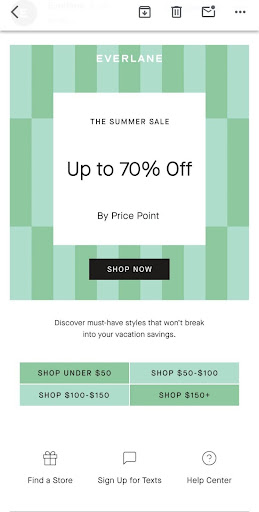
- Mobile-friendly CTAs
Every email needs a clear call to action (CTA), that final nudge to get your readers to do what you want them to, whether visiting your website, purchasing, or signing up for your newsletter. But on mobile devices, where screens are small, and fingers are sometimes fumbling, clear CTAs are even more important.
Here's how to craft CTAs that are mobile-friendly and impossible to miss:
- Make your CTA buttons stand out! Use a contrasting color that pops against your email's overall design.
- Make the buttons large enough so everyone can pick them out easily. We all know how frustrating "fat finger errors" can be!
- Don't crowd your CTAs. Leave ample white space around your buttons to prevent accidental clicks on surrounding content.
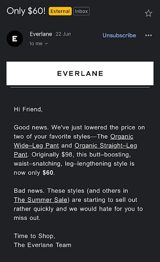
- Avoid placing links within the text or images. Such CTAs can be harder to select and, in the case of images, sometimes even harder to see if the images don’t load properly. Instead, use clear, distinct buttons that are easy to tap.
You can see this in the example from Everlane.
Wrap Up
By following these simple, effective tips, you'll be well on your way to creating responsive and mobile-friendly emails that your on-the-go readers will love. Your emails will be visually appealing, easy to navigate, and designed to drive action, ensuring your audience stays engaged and connected.

Head Of Digital Marketing
Recent Blogs


Isha Choksi
How AI Helps Social Media Managers Plan Content Faster
-

24 Jul 2026
-

5 Min
-

52

Jane Hart
The Biggest Mistakes Sellers Make While Expanding to Multiple Marketplaces
-
22 Jul 2026
-
5 Min
-
91


Jane Hart
How to Evaluate a Software Development Company's Portfolio: What Actually Matters Beyond the Logos
-
14 Jul 2026
-
5 Min
-
290