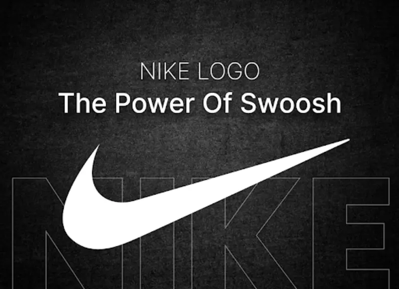
Nike Logo Design: Exploring Its Symbolism and Meaning
-
Last Updated:

03 Sep 2025
-
Read Time:

6 Min Read
-
Written By:
 Harshita Toplani
-
60
Table of Contents
From a $35 design to a billion-dollar icon—the Nike Swoosh tells a story of speed, simplicity, and global influence. Discover how it became more than just a logo.
Nike is a brand known all around the world. Whether you're an athlete, love sneakers, or have just worn a hoodie, you've probably heard of Nike.
The name makes people think of top performance, hard work, speed, and a stylish look. You probably recognize the Swoosh and the words "Just Do It." That one smooth, curved line, with no extra details, has the power to influence people and change the market. The Swoosh is proof that simplicity, when done right, carries weight.
Origin of the Nike logo
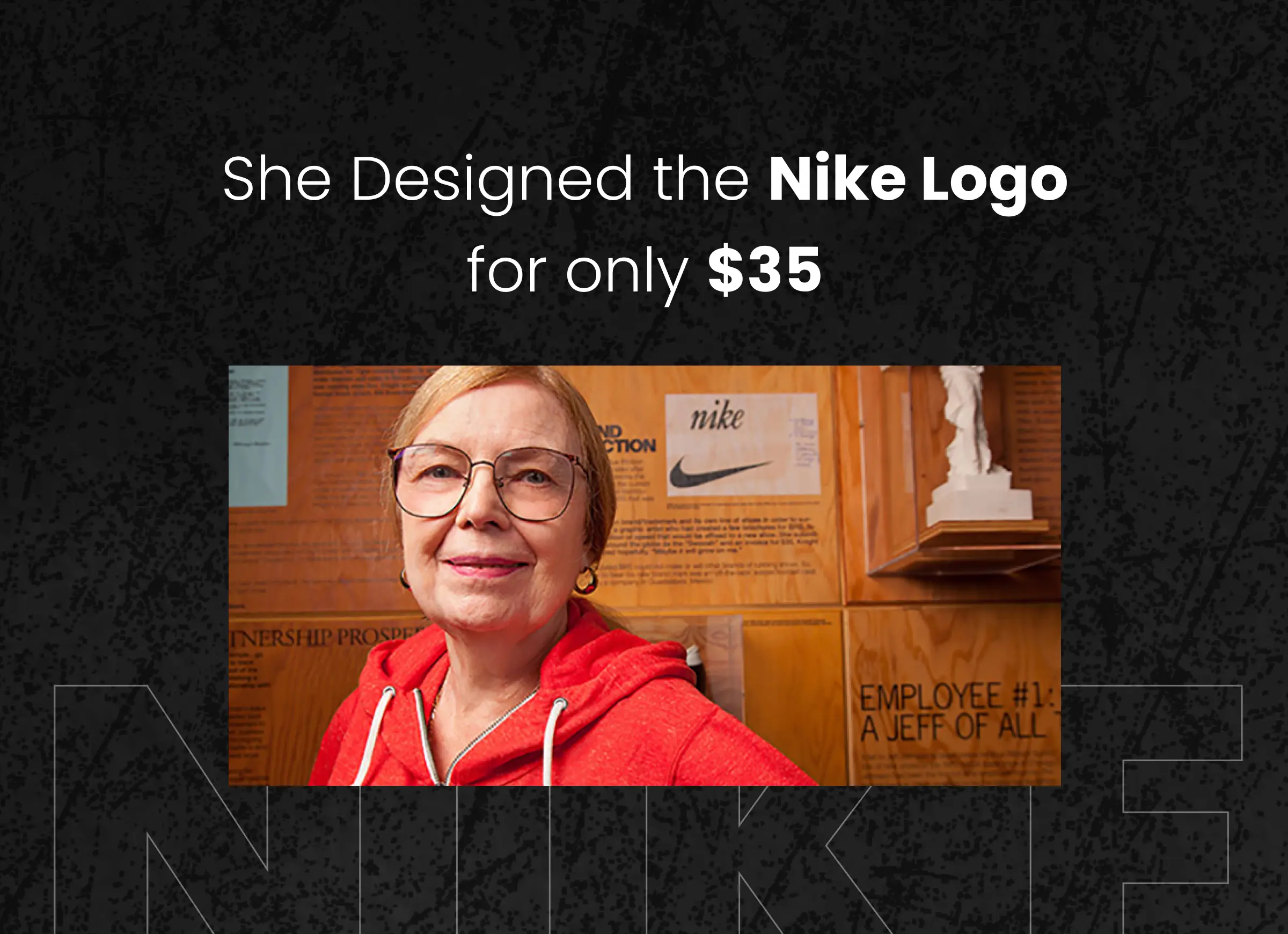
The Logo of Nike company started with the graphic design student at portland. Carolyn Davidson was asked to design a logo which was requested by co-founder Phil Knight of Blue Ribbon Sports (later Nike).
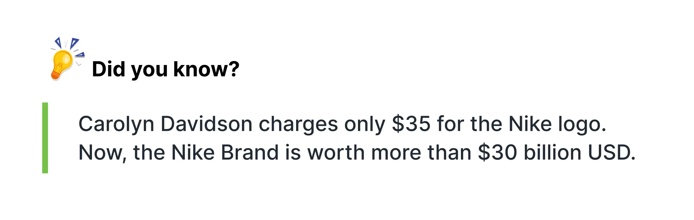
Phil Knight was in search of a new logo for his new product of athletic shoes. He requested a graphic design student to help him out in designing the game-changing logo. Carolyn Davidson tried and tested several logos and in the end, created a Swoosh for which she was paid just $35. However, her idea was inspired by the wings of the Greek goddess of victory.
At first, the Swoosh didn’t get much attention. Even Phil Knight said he wasn’t a big fan, but he thought it might grow on him. Turns out, he was right.
Around the 90s, Nike got a partnership with Michael Jordan and assisted them in making the swoosh a mark of style and a symbol of sports. This perspective turns out to be the door to success. Later on, they reared the Carolyn Davidson with the Nike company stocks and a gold Swoosh ring to recognize her work.
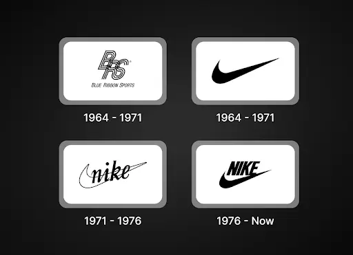
Evolution & Refinement of Nike Symbol
The Nike logo, known as the Swoosh, has changed over time. The updates were small but made a big impact. It started simple and grew into a global symbol.
(Nike logo pictures)
A quick look at Nike logo history:
1971:
Design student Carolyn Davidson created the first Swoosh for $35. The curved line was meant to show speed and motion, matching Nike’s focus on performance.
1978:
Nike added its name in a bold, slanted font. The tail of the "e" is connected with the Swoosh to make it look smooth and dynamic.
1985:
Nike Company introduced a new color scheme. The white Swoosh and name sat on a red background, making it stand out more.
1995:
Nike new logo was just kept as only the Swoosh. It was now strong enough to represent the brand on its own.
The logo’s changes reflect Nike’s growth. It started with a simple idea and became a powerful, stand-alone symbol of excellence.
Symbolism Behind the Nike Logo Design
(Nike logo png)
The logo of Nike isn’t just a mark. It moves with energy. The line curves with purpose, not passivity. That curve suggests motion, drive, and momentum. The logo Nike created speaks a visual language that fans and athletes everywhere instantly recognize and feel.
Nike’s logo connects with everyone. Marathon runners, skateboarders, soccer moms, and even toddlers see meaning in it. The Nike logo design isn’t tied to one sport or group. It reaches across generations, genders, and cultures. It's simple, but it says a lot.
What’s amazing is how the logo of Nike adapts. It fits any space where effort and ambition exist. One single stroke becomes a global symbol. The Swoosh stands for motion and power. That’s why the logo Nike designed continues to inspire.
Nike Logo Design in Action
The Cool Nike logos we see today are among the most recognizable and adaptable designs. It can be found on advertisements, billboards, apparel, shoes, jackets, and even stores. It remains obvious and bold whether it's on a skyscraper or a sneaker.
A smart move in Nike logo branding is using just the Swoosh. No name. No slogan. Just the curve. And yet, it says everything. It speaks to confidence, history, and belief. These cool Nike logo designs has become more than a brand. It stands for motivation and success.
Even online, the Swoosh works perfectly. The white Nike logo looks clean and sharp on screens. On apps, social media, and websites, it fits any space. Whether it's small or large, still or moving, the logo keeps its impact. It always stands out.
A Closer Look at the Nike Logo
Despite seeming simple at first, the Nike Swoosh incorporates motion into its design. It is bold and thick at first, then thin off slowly, almost as if it were taking off. Lift, speed, and movement are suggested by that curve.
There’s a smooth, natural flow to it. It's not a sharp or rigid curve. It has the feel of a confident brushstroke, centered, and nearly hand-drawn. The logo's energy comes from the flowing shape. It is simultaneously strong, peaceful, and clean.
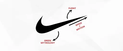
Beyond design, Nike logo has major meaning. The Swoosh takes inspiration from Nike, the Greek goddess of victory. That story adds depth. The logo speaks to ambition, effort, and rising above. It’s not just about sport. It’s about the spirit of pushing forward.
What makes the Nike logo stand out is how well it works everywhere. In black, white, stitched, printed, or lit up, it keeps its identity. No matter where it appears, the Swoosh always feels bold, clear, and full of purpose.
Nike Logo as a Cultural Symbol
 ?
?
The Swoosh is more than just a logo. It has become a cultural force. Nike is closely associated with global sports. Starting from Olympics to the World Cup championships to the NBA. This swoosh has shown its magic in biggest events at the global level.
But its influence goes beyond sports. Nike’s bond with streetwear and youth culture helped shape fashion. The Air Jordan line didn’t just change basketball shoes. It introduced a whole new style. The Swoosh stitched on the side became a mark of status.
Nike has also taken bold steps in social issues. Markting and branding campagins where the featuring of Colin Kaepernick and Serena Williams gave the logo a stronger voice. In those moments, the Swoosh stood for courage, determination, and standing up for what matters.
People wear it with pride. Some even get it tattooed. For many, the Swoosh is more than branding. It reflects personal stories, goals, and belief. It speaks to rising above challenges and pushing forward with purpose.
Final Word
why does the Nike Swoosh morph from a logo into something more? Why do people have a personal connection to it? Because it’s more than design. It’s built on purpose, vision, and years of consistency.
For over fifty years, the Swoosh has stood for athletic excellence. It’s been there during world records, championship wins, and everyday workouts. From stadiums to city streets, and from sneakers to screens, it’s everywhere.
The Swoosh doesn’t just promote products. It promotes belief. It tells you that you can push harder, go faster, and aim higher. It’s not about selling shoes. It’s about unlocking potential.
The real power of the logo is how it makes people feel. The Swoosh allows to believe in yourself.. That’s why it stays as the one of the most iconic & powerful symbols in design industry today.
Want to create a logo with lasting impact? Explore top logo design and branding experts at SelectedFirms and find the right creative partner.
FAQs
The Nike Logo was designed by the Carlson Davidson, who a just a Graphic Design student. She got only $35 at that time.
The Nike logo is a Swoosh, and it is inspired by the wings of the goddess of victory.
Nike now-a-days usually uses just the Swoosh with no text. However, the name used in any situation is in a clean and bold font, which is sans-serif, similar to Futura kinda but still can’t define that it is exactly the same.
Web Content Writer
Recent Blogs


Jane Hart
Embedded Firmware Development for Reliable IoT and Industrial Systems
-
26 Aug 2025
-
10 Min
-

61

Harshita Toplani
12 Best Streameast Alternatives for Safe Streaming in 2025
-
29 Aug 2025
-
20 Min
-
58

Jane Hart
What Happens When Your Business Systems Can't Talk To Each Other Properly
-
25 Aug 2025
-
6 Min
-
53

Jane Hart
Choosing the Right Data Platform Development Partner for Healthcare Organisations
-
25 Aug 2025
-
6 Min
-
61