Table of Contents
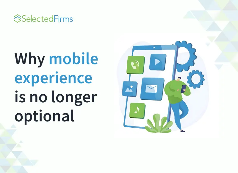
Mobile is now the main entry point to digital products and this article explains why mobile experience is critical to the Drupal ecosystem while outlining common pitfalls and practical optimization strategies.
Most of the time, a typical Drupal user dismisses it only as “just another CMS”. But when someone digs deeper, they might discover that it can be much more than that. If used properly, Drupal can become the staging ground for an entire digital ecosystem, where everything works in tandem to achieve business goals.
Within that ecosystem, the mobile layer has become non-negotiable. People spend more hours on phones than on desktops, and in most industries, the mobile journey is the one that makes or breaks conversions.
Mobile isn’t a secondary channel anymore. It’s the first place people land, the place they make decisions, and often the only place they interact with your brand. If it doesn’t work well, you might never see them again.
This article takes a closer look at why mobile has become such a central piece of the Drupal puzzle, the kinds of obstacles companies usually run into, and the ways Drupal can bend and adapt to help overcome them.
Understanding the Drupal Digital Ecosystem
For many, the word “Drupal” still brings to mind a simple content management system, something you install to publish pages. But anyone who’s spent real time with it knows that what people call the “Dru4pal ecosystem” is much more than that. It’s closer to a living environment, a collection of different systems, practices, and tools that work together without tripping over one another.
The Drupal digital ecosystem contains:
- Content management isn’t just the act of posting articles or product descriptions. It’s about shaping information in a way that allows it to show up in dozens of different contexts: your website, a mobile app, maybe a partner’s portal, or even on devices you wouldn’t have imagined five years ago.
- Integrations are the glue holding the business stack together. Sales may depend on CRM software, finance can’t run without ERP, and marketing teams lean on automation platforms. Drupal acts as the bridge between all of them.
- Workflows sit behind the curtain, making sure collaboration doesn’t turn into chaos. Who gets to edit? Who approves? How are translations handled? All of those checkpoints are part of the ecosystem, too.
- Design systems keep things looking and behaving consistently, whether through themes, reusable interface patterns, or accessibility guidelines that make sure nobody is excluded.
- Analytics and reporting bring to light behavioral events that are actually meaningful: clicks, journey stages, KPIs up, KPIs down.
- And finally, there’s the user experience layer — the part that most people see and care about. It’s where all of the above comes together, whether on a desktop browser, a phone, or some emerging channel we’re only beginning to experiment with.

Mobile cuts through every one of these layers. A system might be rock-solid in terms of content structure or backend power, but if a customer taps in from their phone and the interface lags, the whole ecosystem feels broken.
“Think of Drupal as the engine room of a ship,” Yauhen points out. “It powers everything, but the passenger experience depends on the deck above. Mobile is that deck — it’s where people live. If it shakes or creaks, no one cares how strong the engine is.”
Why Mobile Experience Matters More Than Ever
In the past, mobile optimisation was a competitive edge. Today, it’s the baseline. Companies that treat mobile readiness as optional are already falling behind — in rankings, in user trust, and in conversions.

Mobile-First Indexing and SEO
Since Google shifted to mobile-first indexing, your mobile site isn’t just “a version” of your product — it is your product in the eyes of search engines. The polished desktop site you’re so proud of? If your mobile version struggles, it won’t matter.
“Businesses sometimes don’t realize they’re being judged on mobile first,” the author points out. “They polish the desktop version, but Google doesn’t even look at it anymore.”
Shifting User Behaviour
More than half of all global web traffic now comes from mobile devices. In industries like ecommerce, travel, and hospitality, the number is even higher. People no longer “go online” — they’re always online, browsing in short bursts whilst commuting, waiting in line, or watching TV. That means decisions are made in seconds, not minutes.
“What’s interesting,” Yauhen adds, “this is how little patience users have. If a button is too small, or a form asks for too much typing, they’ll just abandon it. On mobile, frustration has no buffer.”
Business Impact
The cost of poor mobile design is measurable. Even a three-second delay in load time can slash conversions by 20%, and the longer it takes, the more conversions you’ll lose. Navigation that feels awkward or confusing doubles the bounce rate. Even subtle details, like a form error that isn’t explained, can mean the difference between a completed purchase and an abandoned cart.
“I’ve seen businesses invest millions in backend systems,” the author reflects, “only to lose customers at the last mile because the mobile flow felt clumsy. That’s like building a luxury hotel and then putting a broken door at the entrance.”
Common Pitfalls
Plenty of businesses stumble over the same issues again and again:
- Slow loading — heavy images, bulky scripts, and missing caching all combine to make pages drag.
- Non-responsive design — what looks polished on a desktop can collapse into a mess once it hits a phone screen.
- Clunky navigation — menus too tiny to tap or buttons crammed together make even simple actions frustrating.
- Accessibility gaps — unlabeled forms, low contrast colors, and a lack of support for assistive tools shut people out entirely.
On their own, each flaw might actually pass unrecognized. But stack them together, and you end up with an invisible wall that quietly pushes users away before they even have a chance to complain.
How to Improve Mobile Experience in Drupal
Improving mobile within Drupal requires attention across multiple dimensions.
Responsive Design
Drupal themes and Layout Builder give flexibility, but they must be used thoughtfully. Instead of designing for desktop and shrinking down, start from mobile constraints.
“Teams still sometimes build desktop first,” Yauhen says, “and then wonder why the mobile looks broken. It should be the other way around: mobile first, then expand. It’s strange, but for some reason, people still approach it the old way.”
Practical steps:
- Use mobile-first themes.
- Test across real devices, not just emulators.
- Build reusable responsive components.
Performance Optimisation
Performance is where most Drupal sites stumble. Caching and CDNs are essential, but so is image optimisation. Lazy loading, responsive image sets, and compression can dramatically improve speed.
“Every second of delay on mobile feels longer,” the author notes. “Users expect the same smoothness as a native app. If your site lags, they’ll go find one that doesn’t.”
Practical steps:
- Enable caching layers.
- Serve scaled images.
- Minify CSS/JS.
Mobile Navigation and UI
Navigation must be touch-friendly. Menus should open easily, tap targets must be large, and forms need clarity. Accessibility guidelines ensure inclusivity, which also improves usability for everyone.
Personalisation and Mobile-First Content
Mobile content needs to be concise. Long paragraphs that work on desktops overwhelm on small screens. Personalisation can make interactions even smoother.
“Personalisation isn’t about giving people everything,” Yauhen explains. “It’s about giving them less — but exactly what they want.”
Integrations and Mobile Apps
Drupal’s API-first architecture supports headless setups. It can power PWAs or integrate with native apps. This allows companies to extend the CMS into mobile-specific experiences without duplicating data.
Future Trends to Watch in 2026
What do you think the future holds for Drupal. You can be certain that Mobile is the center of this paradigm shift. Today is just so small; it is nothing at all in the grand scheme of things: all new patterns are shaping the way users will interact with digital products from now onwards.
Decoupled/Headless Drupal
By separating the frontend from Drupal’s backend, teams gain the freedom to build mobile apps that pull content through APIs. This approach lets businesses reuse Drupal’s strong content management capabilities while experimenting with modern mobile frameworks like React Native, NativeScript, or Flutter.
“Headless setups are especially powerful for companies that want both a website and an app sharing the same data,” the author explains.
Progressive Web Apps (PWAs)
PWAs are blurring the line between websites and native apps. They bring offline functionality, push notifications, and app-like speed directly to mobile browsers.
For organizations that don’t want to invest in separate native apps, PWAs powered by Drupal offer a cost-efficient way to deliver near-native experiences. Still, it’s worth remembering that their functionality remains somewhat limited compared to full-fledged applications — they’re more of a smart compromise than a complete replacement.
AI-Driven Personalization
AI is moving personalization beyond simple rules. By analyzing user behaviour, location, and even the type of device being used, AI can adjust what content appears and when.
Imagine a news portal built on Drupal that highlights breaking stories differently for a commuter on a smartphone versus someone browsing at home on a tablet. “AI lets us meet users where they are, not just where we expect them to be,” Yauhen adds.
Voice and Gesture Interfaces
Mobile is no longer only about touchscreens. With the rise of smart assistants and wearable tech, voice commands and gestures are becoming standard input methods. For Drupal, this means preparing content structures and APIs that can be delivered in audio form or triggered by non-traditional interactions.
“Mobile is moving beyond screens,” Yauhen notes. “Voice, gestures, even wearables are becoming part of the ecosystem. Businesses that start preparing now will be the ones ready when those inputs become everyday habits.”
Benefits of Drupal Mobile in the Ecosystem
Optimizing mobile within Drupal is not just about looking modern; it directly improves how the entire digital ecosystem functions.
Data Management. When mobile and desktop experiences are aligned with the same backend, data flows without gaps. Not long ago, mobile dashboards often showed trimmed-down reports, while the full picture was only available on desktop. That created blind spots. Today, a sales manager on the move can access the same level of detail as the executive team in the office. “Mobile breaks down those barriers,” the author points out. “It makes data accessible in the exact moment someone needs it, not just when they’re sitting at a desk.”
Integration. Modern businesses rely on a web of systems — CRMs, ERPs, analytics platforms, and marketing tools. When Drupal is the hub and mobile is treated as part of that hub, workflows don’t stop at the office. Imagine a customer filling out a mobile form and that information instantly syncing with Salesforce or SAP. No lag, no duplicate entry, just seamless flow.
Visualization. Data is only as good as the way it’s presented. Dashboards that collapse elegantly on mobile let managers catch trends quickly, whether they’re traveling or in the middle of a meeting. Small touches like simplified charts or collapsible tables make analytics usable without losing depth.
Engagement. A responsive, intuitive mobile journey increases trust. Customers who can complete a checkout, students who can find their schedule, or patients who can access records on the go all associate reliability with your brand. “When mobile feels smooth,” Yauhen says, “users stop noticing the technology. They just enjoy the experience.”
Compliance. Security and compliance don’t stop at the desktop. GDPR, HIPAA, and similar rules require encrypted, permissioned access across all devices. Drupal’s role-based permissions extend naturally into mobile, making sure sensitive data is still safe when it’s viewed outside the office.
“Done right,” the author stresses, “mobile improvements don’t just help users. They lift the whole ecosystem. Suddenly, data is cleaner, workflows are faster, and decisions are made in real time. That changes how the whole business operates.”
Conclusion
Drupal can power some of the most complex digital ecosystems in the world, but without mobile, even the strongest setup risks falling short.
Mobile is no longer a “channel” that runs parallel to desktop. It has become the main entry point, the place where first impressions are made, and where most user actions take place. For businesses, that means the stakes are high: a broken layout, a lagging checkout, or an inaccessible menu can mean lost conversions, lower engagement, and reputational damage.
“Mobile isn’t optional anymore,” Yauhen concludes. “It’s the main stage where people meet your brand. If that stage feels shaky, the whole show suffers. But if you invest in it now, the experience feels seamless — and users remember that.”

Head Of Digital Marketing
Recent Blogs


Isha Choksi
How AI Helps Social Media Managers Plan Content Faster
-

24 Jul 2026
-

5 Min
-

52

Jane Hart
The Biggest Mistakes Sellers Make While Expanding to Multiple Marketplaces
-
22 Jul 2026
-
5 Min
-
91


Jane Hart
How to Evaluate a Software Development Company's Portfolio: What Actually Matters Beyond the Logos
-
14 Jul 2026
-
5 Min
-
289