Table of Contents
Want to understand how design Influences Consumer Behavior? This guide explores the psychology of marketing and how to use design to influence your audience.

In a saturated and fast-paced world, marketers constantly look for ways to catch customers' eyes and influence them to buy their products.
One of the ways to do it is through psychology. While you might think that psychology is only applicable in scientific endeavours, marketing psychology is, in fact, commonly used by marketers today. This is done by simply incorporating psychology principles and applying them through design or marketing strategies to influence customer actions and behaviour.
Look at some of today's most commonly used marketing psychology techniques.
Color Psychology
Color psychology studies how specific colors can affect or influence a person's perception, mood, or feelings. In marketing, color subconsciously influences a customer's buying behavior or impression of your brand.
For example, red incites hunger, so fast-food chains like KFC and Wendy's typically use red in their branding. Red is also associated with action, which is why most buttons on websites (ex., The "Play Now!" or "Buy Now!" buttons) are colored red.
On the other hand, the color blue symbolizes stability, security, and trust. This is why pharmaceutical companies, banks, airlines, and government services mainly use this color. Blue is also the color most preferred by men. Therefore, using blue for marketing can increase sales of products or services catering to men.
Orange is associated with youth, playfulness, and energy. For this reason, brands targeting younger audiences, such as Nickelodeon and Fanta, use orange as their predominant branding color. However, orange can also be associated with immaturity, so corporate brands that want to show a severe image should avoid this color.
Aside from its psychological impact, color is essential in many other ways. According to a study, having a signature color can lead to an increase of 80% in brand recognition, and customers can forget a brand name but easily remember your brand colors.
Color can also matter depending on the platform that you use it. For example, in websites, 46% of customers prefer seeing blue, while 23% say that yellow is the worst website color. While your website color should still depend on your branding, having this kind of data can still help you make more informed decisions.
Shape Psychology
Like in color psychology, shapes can also influence a customer's opinion of a brand. Squares and rectangles are the most common shapes in building cell phones and books. They can also be used in contrast with busier patterns or colors.
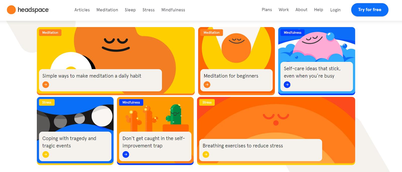
Circles, ovals, and ellipses connote softness, flexibility, and motion. Without rough edges, rings evoke lightness and friendliness. Mindfulness app Headspace mainly uses round shape characters for its marketing materials. This reinforces their brand identity as positive, approachable, and friendly.
Triangles, on the other hand, suggest motion, energy, and unpredictability. The triangle's placement matters, too- an upright triangle can signify power and stability, while downward triangles can show risk and danger.
Shapes can give direction. You can use arrows or triangles to direct your customers to specific parts of your website or mobile app. Text can be framed with a square or rectangle. This can be utilized in marketing materials such as Facebook Ads where you can place your CTA inside a square box.
Design Layout
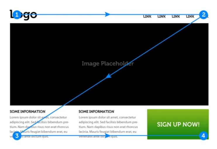
Your layout pattern, whether in your website, mobile app, or marketing material, significantly impacts catching your customer's attention and retaining their interest. Two of the most commonly used patterns are the F-pattern and the Z-pattern, derived from eye-tracking studies.
In the F-pattern, users will first read in a horizontal movement, move down the page a bit, and then read in a horizontal direction again, forming an F-shaped pattern. This is mainly observed in text-heavy pages. Therefore, placing your crucial text in an F-pattern is recommended to ensure your customers can see it immediately.
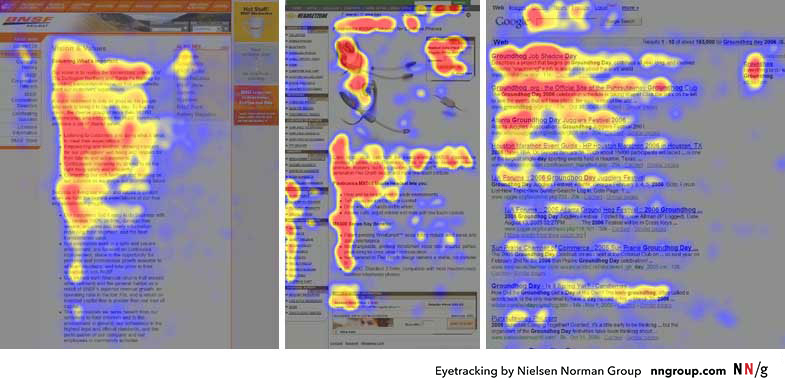
In the Z-pattern, it is observed that with more simple or fewer text-heavy pages, users tend to read in a Z-pattern. Therefore, placing your CTA on the end of the Z-path is a great way to ensure that your customers will see it and hopefully lead to conversion.
Creating a good flow for customers to take in information naturally is vital to retaining their interest. Consider using these patterns when designing your various marketing materials.
Visual Hierarchy
Visual hierarchy is the design principle where you arrange elements based on their order of importance. For example, the reading patterns, as discussed above, are a part of the visual hierarchy. Other elements are size, space and texture, color, direction, and typeface weight.
Size is the easiest to explain. People tend to read the more important things first. So when designing your marketing materials like posters or flyer templates, you should use a bigger size for the more important text.
Another way is to use space in your designs. For example, if you want your customers to click your "Buy Now" button, giving ample space around the button can help direct their eyes to it.
Color is also easy to explain. Use brighter colors for more important information, or pair a lighter color with a darker background to draw a contrast in your designs.
Direction can be used in contrast to the reading pattern. For example, if the typical way is to read from left to right, having your materials in a right-to-left format can draw more attention since it breaks the usual pattern.
Last is the typeface. Your choice of typeface, placement, weight (Whether you'll use a bold or heavier font), and direction (Is it italicized? Center aligned, or right aligned?) can lead to different results. For example, you can draw attention to your marketing materials' focal points by using a bold font, aligning it in the center, combining different typefaces, and many more.
Hick's Law
Hick's Law states, "The time it takes to make a decision increases with the number and complexity of choices available." For example, imagine that there is an ice cream shop that offers 50 different flavors. It's more overwhelming compared to if they only provide five flavors.
With all the options available, you might second-guess your flavor choice and not buy anything. The same idea works in marketing, particularly in UX design. Limiting options for a customer is a great way to lessen "information overload," which is the leading cause of people not making a decision.
This can be done in multiple ways. One is to limit text and visuals on home pages or landing pages and only include essential information. You can also do this during the payment process by breaking it down step by step so that the customer will only need to do one thing at a time.
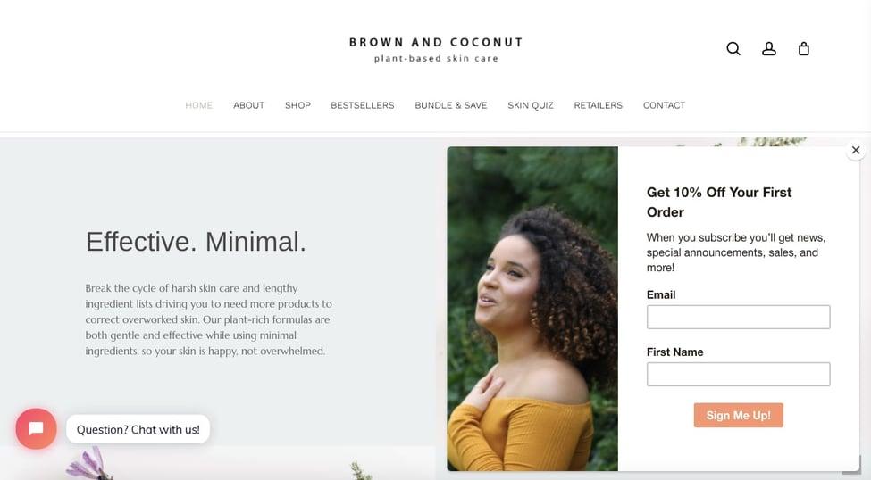
Another is when designing sign-up forms, limit the fields a user needs to fill up so that there is a higher chance of them finishing the paper.
An example of this is Brown and Coconut, where a customer needs to only fill-up two details to sign-up for their newsletters
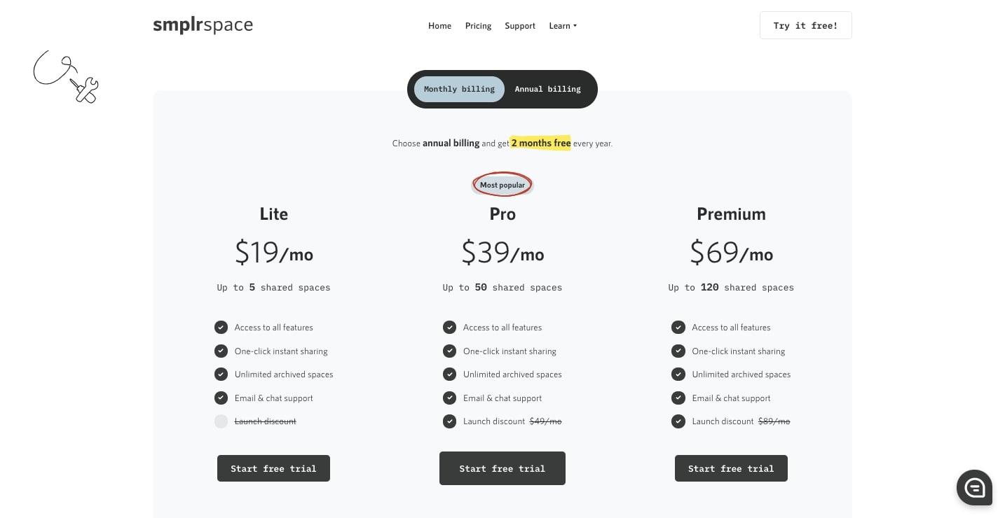
You can also apply Hick's Law by highlighting a specific option you want your customers to do. For example, you are providing three pricing plans for your product. You can highlight the chance that you want your customers to take.
This principle is essential, as it provides a great user experience, leading to customers returning to your brand.
Social Proof
Social proof is the psychological principle of looking at other people's actions or behavior to determine what to do. It's similar to a group mentality, where you would want to do the same if other people do it.
The same concept applies to marketing. For example, 95% of customers look for reviews first before buying a product, while 58% would pay more for a brand with good reviews. And speaking of reviews, getting a 5-star rating is crucial since it is the top factor customers use to judge a brand.
Another way to get social proof is to get influencers, celebrities, or known figures to vouch for your product. One of the reasons why influencer marketing is on the rise now is because it gives brands that "trust factor," as people tend to trust recommendations from other people instead of the brand itself.
Another example is adding badges or awards. These are usually seen on websites where brands put badges that they have received from third-party organizations. After all, receiving a certification from another authority figure signals to a customer that your brand is legitimate and reputable.
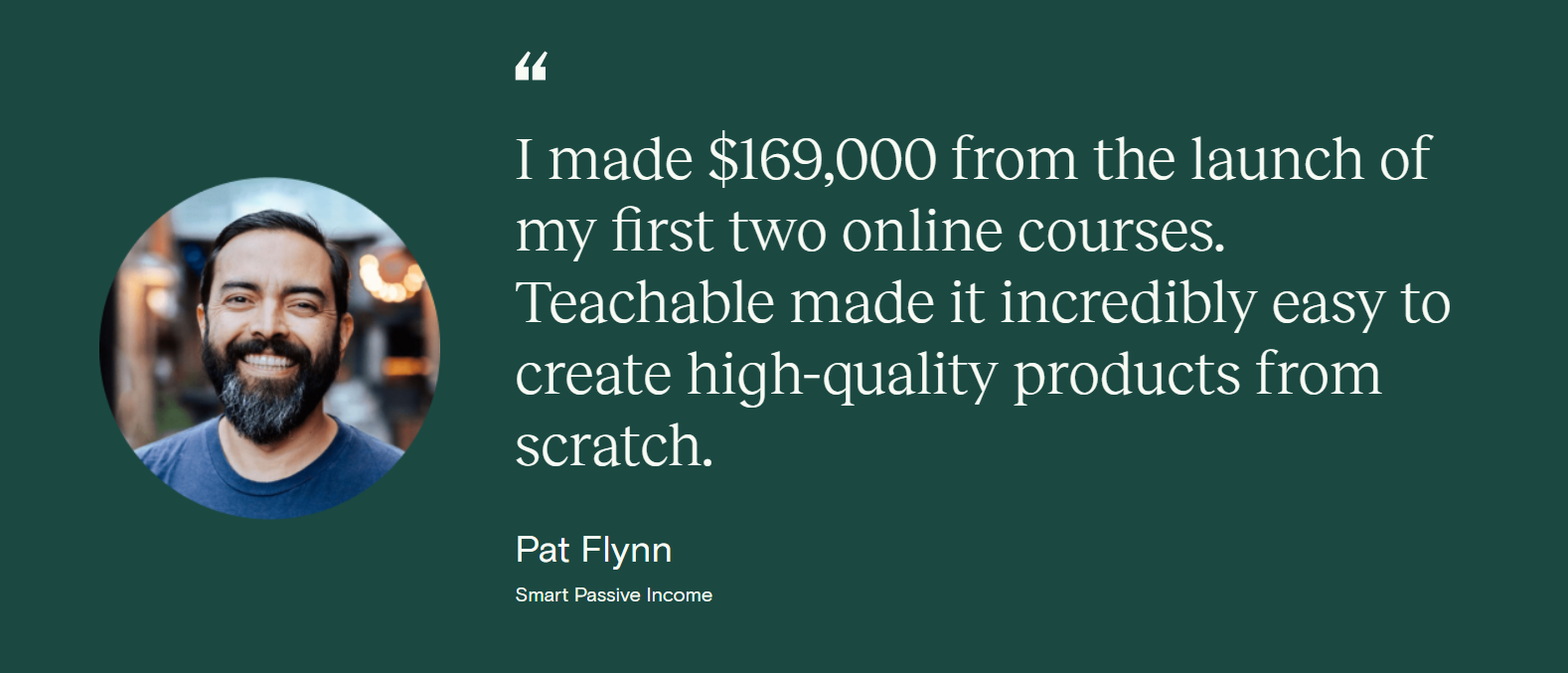
Add social proof to increase your brand's reputation and drive more sales. For example, you can mention in your ad copy that your product is "Trusted by over 10,000 customers", is the "Best-selling product of 2022", or insert a screenshot of a positive review from your customers.
Conclusion
Understanding psychology, specifically marketing psychology, is essential to understanding your customers. And knowing your customers and their behavior can help you create better design and better content that is tailor-made to them. This will increase brand recognition, brand loyalty, and, perhaps most importantly, sales.

Head Of Digital Marketing
Recent Blogs


Isha Choksi
How AI Helps Social Media Managers Plan Content Faster
-

24 Jul 2026
-

5 Min
-

52

Jane Hart
The Biggest Mistakes Sellers Make While Expanding to Multiple Marketplaces
-
22 Jul 2026
-
5 Min
-
91


Jane Hart
How to Evaluate a Software Development Company's Portfolio: What Actually Matters Beyond the Logos
-
14 Jul 2026
-
5 Min
-
290