Table of Contents
Learn how to get your company noticed in the digital world with these five proven eCommerce marketing strategies.

Are you launching an e-commerce business? You’re not alone. There are 2.5 million e-commerce businesses in the United States, with millions more worldwide. However, with major retailers like Amazon controlling the market, it’s harder to stand out.
Your marketing strategy must set you apart and break through all the noise. That strategy starts with an e-commerce website that’s right for you and your industry. Whether you plan on using an out-of-the-box solution or working with a developer to custom-code your website, here are a few things you need to consider before launching your site.
Understand the problem you’re solving
Before building a successful e-commerce website, you must comprehend why you’re making it. Every company seeks to provide a solution to their customer, whatever it may be.
Breaking through the noise starts with understanding what the noise is and isn’t and asking essential questions like:
- What companies exist in your industry?
- What gaps are present?
- How can your product better the industry and make life better for your customers?
Say you want to launch a fashion company. You’d be entering one of the largest industries in the world. The fashion industry will be more than $1.7 trillion worldwide in 2023. New companies launch daily, many of whom cannot compete with the top players and go unnoticed and, eventually, fail.
Differentiation is vital when launching a fashion brand, but to differentiate, you need to understand how the problem you solve makes you different. For example, you may need more sustainably sourced clothing staples. You’re seeking to solve the issue that fast fashion is often unsustainable. That problem-solving needs to be central to your website design and your marketing.
Before creating your e-commerce website, consider following a simple problem-solving framework to help your brand compete better. The first step is to understand the problem. In this case, the problem is fast fashion needs to be more sustainable and leads to clothing often wearing out quickly.
The next step is designing the solution. Think about how your product seeks to reduce this problem. With a sustainably sourced fashion brand:
- How do you produce your clothing?
- What makes you different from fast fashion brands?
The final step is to build the best solution. Once you determine the best solution, you’ve found your path to marketing. This answer you’ve come up with is a significant factor in your differentiation. Your website and overall marketing plan must demonstrate why your solution is better than your competitors and how you’re filling a gap in your industry.
Understand Your Market
While you must understand your company goals before launching your e-commerce website, understanding your competitors is also essential. Study what your significant competitors offer and how they market those offerings.
Implementing effective strategies to increase ecommerce sales can provide a competitive edge in a saturated market.
Some companies make the mistake of believing they should copy what their biggest competitors are doing to replicate their success. Unfortunately, following this pattern is a great way to demonstrate to your potential buyer you’re not offering anything new and are unworthy of their attention. For an enhanced online presence, supplement your site with visually compelling content. You can find high-quality design templates that elevate your branding and engage visitors more effectively.
But that doesn’t mean you can’t take some learnings away from your competitors’ strategies. However, it would be best to twist those learnings to fit your brand.
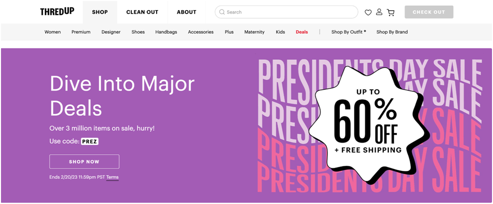
Let’s compare two significant players in the fashion industry: Poshmark and thredUP
Both are reselling websites, but they function differently. You can submit your garments to thredUP for the website’s team to pick what it will and won’t list. With Poshmark, you’re doing the posting and selling yourself. Poshmark lets you post almost anything you want to sell. thredUP only shares clothing and accessories.
Each website has its negatives and positives. Some people might like that thredUP does most of the work for them. Others might like that Poshmark is more flexible. A company seeking to enter the reselling game could benefit from learnings from either company.
When you understand your competition, you give yourself a better chance at holding your market share against them. Before building your website, you should look for ways to implement these learnings into your brand.
Develop And Maintain a Comprehensive Brand Identity
Your brand makes you stand out and creates lines of connection between you and your potential customer. But what goes into a brand?
Your brand identity consists of everything that your customers connect with you. Everything your customer can see is your visual brand identity, from your colour palette to your logo to your customer service’s email signature. Outside of the optical components, you must think about your brand voice. Distinctive brand voices can help you stand out from the pack, although you must be careful about picking a voice that fits the other aspects of your brand.
Snarky brand voices work for some companies, but seeing another company adopt such tactics may be shocking. On the other hand, some companies embrace the shock value. It’s all about what fits what you envision for the company.
Working with a branding specialist or graphic designer can be beneficial when you create your brand identity. Everything you put into the world should have meaning because everything already does, whether you mean it to or not. Consider the importance of colour in branding. Think about how many fast food brands use red, yellow, and blue. Moreover, you can utilize ailogo generator make the branding process easy.
These companies didn’t just pick the colours they liked. Research indicates that red can increase your appetite. Meanwhile, yellow is associated with friendliness, making you more likely to stop for food where you see this colour combination. When you pick your colour palette, you should understand why you’re choosing it.
Perhaps what’s more important than creating a brand identity is maintaining it. You should already have your brand identity built out when building your website. Ideally, you should give your designer all the crucial details they need to replicate your visual brand identity on your e-commerce site.
It’s beneficial to keep a brand style guide for such situations. You’ll want your style guide to include things like the HEX codes for your brand colours, the taglines you use, and all the different forms of your logo you utilise.
Ensure Your Website is Mobile-Friendly
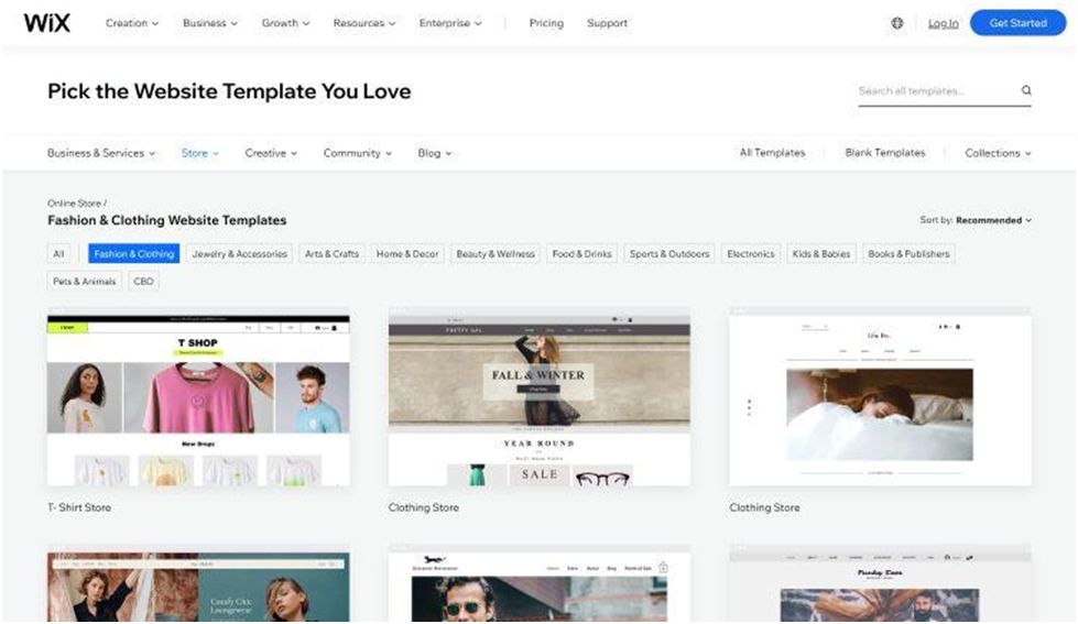
As of 2023, more web traffic happens on mobile than on desktops. So you’re doing yourself a disservice if you only design for a desktop. If you use a premade template for your website, you must test its responsiveness. Website builders like Wix allow you to toggle between desktop mode and mobile mode. Whatever you change to your website in desktop mode, ensure you switch to mobile mode.
These pre-designed website templates are usually reasonably intelligent in that they’ll make mobile changes if you make desktop adjustments. But some things may not move how you want them to, so you should always check to ensure your mobile website looks how you envision it.
If you’re custom-coding your website, ensure your developer understands your high priority on mobile. A custom-coded website may give you more freedom to create your desired website. However, suppose your developer is focused solely on a desktop website. In that case, it won’t matter much because many of your potential customers may never see the website you wanted to put out.
Invest in the user experience
A difficult-to-navigate e-commerce website won’t be around for long. There’s a lot to consider when it comes to your user interface. Coding is just one part of the website-building puzzle. When launching an e-commerce website, you may want to consider working with a UX designer. UX designers specialize in creating websites with better user experiences.
Think about how a user will interact with your website. Of course, you want them to be able to view and purchase your products, but there are many steps to getting to the purchasing point.
It would help if you answered many questions about how you want people to use your website, including:
- Does clicking a new item open a new window or stay in the same one?
- How many pages does your user have to go through during the checkout process?
- Is there a time limit before an item is released to the website after being put in someone’s virtual bag?
Planning the best user experience is hard when you don’t yet have users. So, once you launch your website, you should consider your user experience an evolving concept. The interface you throw with doesn’t have to be ongoing. For example, A/B testing plays a crucial role in e-commerce websites. When you run A/B tests, you’re making minor changes to test one factor on a group while a control group receives the original option.
For instance, see how many people reach the final checkout page when you have two pages to enter shipping and billing information instead of one page. You would have one group that enters their shipping and billing information on the same page and another group that enters that information on the same page. Is there a more significant dropoff of users when you have a second page? Or is there no change? The test results will help you pick the right user experience for your customers because you’re collecting the right intent data that tells you exactly how they want to be marketed at different points in the traditional marketing funnel.
Ready to Launch Your eCommerce Website?
A great deal of preparation goes into launching an e-commerce website. Are you on track to creating one that can cut through the noise and allow you to stand out in your industry? The first step is understanding the problem you’re seeking to solve.
What does your company accomplish? The next step is understanding your competitors. While you shouldn’t simply copy your competitors, you should look for their strategies to gain insight into your market.
When developing your website, there are three crucial factors to consider: your brand identity, mobile interface, and overall user experience. Your brand identity helps your potential customers find you and allows you to build brand loyalty. When your customers are ready to buy, research suggests they’re more likely to look you up on mobile than ever.
When they do, you want them to see a mobile-friendly website. Their overall user experience may differ between completing a purchase or stopping mid-checkout. But by planning a website that’s on-brand, mobile-friendly, and user-friendly, you can thrive and stand out among the rest.
Read More:
- 5 Successful Ways to Enhance Your eCommerce Customer Experience?
- 12 Essential Best Practices for Building Secure Web Applications in 2025
Source List:
- Influencer Marketing Hub
- Fashion United
- Business Insider
- Zippia
Recent Blogs
Ultimate Guide to People Search Engines for Staffing Agencies and HR Teams
-
23 Apr 2026
-
9 Min
-
88
How to Choose an Adobe Commerce Agency: A Buyer's Guide for Enterprise Ecommerce Leaders
-
22 Apr 2026
-
2 Min
-
132


