Table of Contents
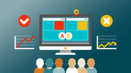
A/B testing remains essential for e-commerce growth in 2025. These 10 proven experiments help optimize user experience, increase conversions, and support data-driven decision-making for lasting success.

The e-commerce game in 2025 has changed. It's no longer enough to have a great product or eye-catching ads. Today’s shoppers crave seamless, meaningful experiences that speak to their needs, earn their trust, and guide them effortlessly to checkout. With shrinking attention spans and rising expectations, standing out in a crowded market demands more than guesswork.
That’s where A/B testing comes in—not as a trendy tactic but as a smart, data-driven way to truly understand what motivates your customers to act.
What Is A/B Testing and Why It’s a Game-Changer in 2025
A/B testing is simple in concept but powerful in impact. You create two slightly different versions of a webpage, ad, email, or element (like a product image or headline), and then you see which one performs better with your actual audience.
It replaces assumptions with insight. Instinct with evidence.
In 2025, this change matters more than ever. Here’s why:
- Ad spend is skyrocketing. You need more conversions per click.
- Third-party data is vanishing. First-party behavior is gold.
- The digital space is crowded. Clarity and efficiency win.
Every test you run gives you a clearer picture of what works—and what doesn’t—so your brand can make sharper moves with fewer regrets, especially when it comes to conversion rate optimization.
10 High-Impact A/B Tests to Run This Year
These aren’t vague experiments. They’re battle-tested strategies tailored to the way consumers shop today.
1. Homepage Hero Banner vs. Homepage Video
What to Test: A static lifestyle image with brand messaging vs. an autoplay or embedded homepage video that showcases your story, product experience, or value proposition.
Suitable for:
- Brand-Focused Stores (e.g., Skincare, Ethical Fashion, Wellness): A high-impact hero image delivers instant emotional appeal and reinforces visual identity without overwhelming new visitors.
- Direct-to-Consumer Startups: Videos help communicate your brand story faster and more dynamically—ideal for building trust when your name is still unfamiliar.
- Product Experience Sellers (e.g., Fitness Equipment, Smart Home Tech): If your product shines when seen in action, video can shorten the education curve and boost conversion by showing value in motion.
- Mobile-Heavy or Performance-First Sites: Hero images load faster and perform better on slower connections. If speed and accessibility are priorities, image-first design may reduce bounce rates and improve UX.
2. Product Descriptions: Short Bullets vs. Storytelling
What to Test: Minimalist bullet points highlighting benefits vs. rich, emotive narratives that explain the product in depth.
Suitable for:
- Premium/Technical Goods (e.g., Cameras, Supplements): Longer content builds trust and answers common objections.
- Quick-Purchase Items (e.g., Accessories, Phone Cases): Bullet points help users scan and act fast, especially on mobile.
- Ethical Brands or Artisans: Narrative-style content allows you to share craftsmanship, impact, or mission.
- Mobile-Heavy Sites: Shorter content can load faster and feel more digestible for fast-moving users.
3. Showing Only Discounted Price vs. Showing Savings (% Off)
What to Test: Just the final sale price vs. the original price plus savings (e.g., "You Save 25%!").
Suitable for:
- Budget-Conscious Shoppers: Savings figures appeal directly to value-seeking psychology.
- Flash Sale Campaigns: Showing urgency and value simultaneously can increase conversions during time-sensitive offers.
- Luxury Brands: In some cases, showing only the final price keeps the design clean and brand tone intact.
- New Customer Funnels: Percentage savings can create a perception of a “better deal” for first-time buyers.
4. Add to Cart Button: Sticky vs. Static
What to Test: A floating “Add to Cart” button that remains visible while scrolling vs. a standard static button placed once per page.
Suitable for:
- Long-Form Product Pages: Sticky buttons reduce friction for users who scroll far before deciding.
- Mobile Devices: Persistent CTAs reduce the chance of users abandoning because they can’t find how to buy.
- Impulse Products: Keeping the action visible makes spontaneous purchases easier.
- Older Demographics: Persistent visibility helps less digitally-native users feel more confident.
5. Email Signup Timing: Instant Popup vs. Exit-Intent
What to Test: Triggering an email offer when the user lands vs. when they start to leave.
Suitable for:
- First-Time Visitors: Early offers may convert bargain hunters faster.
- Content-Led Brands: Exit popups are less intrusive and work better when users are engaged with content first.
- High Bounce Pages: Exit-intent popups can reduce abandonment and capture emails for remarketing.
- Stores With Long Consideration Windows: Capture interest in exiting and nurturing leads over time.
6. Product Page Images: Lifestyle vs. Studio
What to Test: Real-world context (e.g., model using the product) vs. plain studio product shots.
Suitable for:
- Fashion and Accessories: Lifestyle photos help customers visualize themselves using the product.
- Tech and Electronics: Clean, detailed shots work best when specs are critical.
- Home Goods and Decor: Contextual photos show size, color, and ambiance more effectively.
- Multicultural Audiences: Diverse imagery can increase relatability and inclusivity.
7. Social Proof Placement: Top vs. Bottom of Page
What to Test: Positioning testimonials and ratings at the start vs. lower down.
Suitable for:
- High-Consideration Items (e.g., Health Products, Courses): Early reassurance builds credibility.
- New Launches: Front-loaded reviews can overcome skepticism around newer items.
- High-Volume SKUs: Well-reviewed products should flaunt social proof up front.
- Conversion-Optimized Funnels: Placing testimonials near "Buy" buttons reinforces trust at the critical decision point.
8. Shipping Info Visibility: Always Shown vs. Hidden in Tabs
What to Test: Prominently display shipping times, methods, and return policies vs. tuck them under collapsible tabs.
Suitable for:
- Global Sellers: Clear shipping info reduces friction across borders.
- First-Time Buyer Brands: Transparent delivery policies reduce anxiety.
- Gifting Stores: Buyers often want to confirm the timing right away.
- Mobile Shoppers: Always-visible info reduces clicks and taps.
9. Checkout Type: One-Page vs. Multi-Step
What to Test: Streamlined single-page checkout vs. step-by-step guided flow.
Suitable for:
- Mobile-Heavy Traffic: Single-page forms reduce bounce from long load times.
- Older Demographics: Guided steps may feel clearer and less intimidating.
- Repeat Buyers: One-page checkouts speed up familiar purchases.
- High-Customization Products: Multi-step flows handle complex fields more smoothly.
10. Recommendation Style: “Trending” vs. “Just For You”
What to Test: Showing best-sellers to everyone vs. personalized picks based on user behavior.
Suitable for:
- Gift Shops or Seasonal Stores: Trending items help guide indecisive buyers.
- High-Return Customer Base: Personalization boosts retention and upsell opportunities.
- Broad Catalog Retailers: Suggesting the right item from a huge list improves navigation and average order value.
- New Visitor Funnels: Popular picks offer direction for unfamiliar users.
How to Make Testing Actually Work
Here’s how to avoid spinning your wheels:
- Pick one goal. Don’t test everything. Want more sales? Start there.
- Test one change at a time. Otherwise, you won’t know what caused the result.
- Let it run long enough. A couple of days isn’t enough—aim for thousands of visitors or 2–4 weeks minimum.
- Track actual value. Don’t stop at clicks. Monitor revenue, average order value, and lifetime value if possible.
- Use what you learn. Every result—good or bad—is a lesson.
Closing Insight: Winning Brands Never Stop Learning
In 2025, the brands winning market share aren’t just louder. They’re smarter. They test, they learn, and they iterate.
A/B testing is no longer optional. It’s your edge in a saturated market. You don’t need to guess what customers want—now, you can know.
Small tweaks. Big results. That’s the formula.
Curious where to begin? Start with one of the tests above. Measure, learn, adjust. And repeat.

Head Of Digital Marketing
Recent Blogs


Isha Choksi
How AI Helps Social Media Managers Plan Content Faster
-

24 Jul 2026
-

5 Min
-

52
Jane Hart
The Biggest Mistakes Sellers Make While Expanding to Multiple Marketplaces
-
22 Jul 2026
-
5 Min
-
91

Jane Hart
How to Evaluate a Software Development Company's Portfolio: What Actually Matters Beyond the Logos
-
14 Jul 2026
-
5 Min
-
289